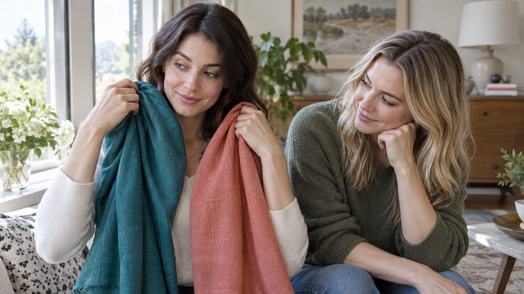
A quiz can be a pleasant way to begin asking what colours suit you, especially if it gives language to a feeling you already have: bright orange is hard to wear, smoky blue is easy, black is either dependable or strangely severe. But a quiz sees only your answers and sometimes a photograph. Your mirror, clothes, and changing daylight can tell a fuller story. Use the result as a prompt, then test it where you actually get dressed.
Why quizzes are better at prompting than proving
Most colour quizzes sort a few inputs into broad directions. They may ask about hair, eyes, jewellery, sun response, or a favourite shade, then connect the answers to a seasonal analysis category. That can point you toward useful comparisons: warm against cool, muted against clear, light against deep. It cannot account for every version of a colour, the effect of your hairstyle, or how a fabric behaves near your face.
A photo-based quiz adds another uncertainty. Cameras quietly change white balance, exposure, saturation, and contrast. The same face can appear cooler beside a blue wall, warmer beneath a lamp, and smoother after automatic processing. A result from an image is not useless, but it is best treated as a working suggestion. If it says you may prefer cooler, softer tones, pull out cool, softened clothing and see whether that direction survives in person.
Quiz language can also sound more definite than it deserves. A label such as winter or autumn may be memorable, but it is not a rulebook. People often borrow successfully from neighbouring palettes, especially for colours worn away from the face. The practical question is smaller and more helpful: which temperature, depth, and brightness make my features look settled rather than overpowered?
Think of a quiz as the first page of a notebook, not the finished answer. It can save time by narrowing the experiments, while the real evidence comes from repeated comparisons. This approach also makes the process kinder. You are not trying to pass into a category; you are learning what supports your own colouring and style.
Compare two colours at a time
The quickest way to understand personal colours is to compare pairs. A large pile of garments makes every choice blurry, while two closely related options make a clear question. Put cream beside stark white, camel beside cool grey, coral beside raspberry, or bright cobalt beside smoky blue. Hold them under the chin or try on tops with similar necklines so that only the colour is changing.
Use indirect natural light near a window. Direct sun creates hard shadows, and coloured walls or warm bulbs can tilt the result. Keep your hair away from the face if it has a strong dye colour, remove tinted glasses, and use a plain mirror. If you normally wear makeup, try one round with a light everyday version and another with very little; the comparison should not depend on a dramatic lip or contour to work.
Give each option a little time. The winning colour is not always the one that makes the strongest first impression. Often it is the shade that lets your skin look more even, makes the eyes visible, and reduces the urge to correct the face with makeup. A difficult colour may pull attention to under-eye shadows, redness, or a yellow-gray cast. Take a quick photograph if helpful, but judge it against what you see in the mirror.
Then change one variable at a time. If cool berry beats warm coral, compare a deep berry with a pale berry before concluding that all cool colours work. If charcoal beats camel, test navy, espresso, and soft black to learn whether the issue is temperature, depth, or both. Small experiments prevent broad rules from becoming accidental restrictions.
Watch the skin, eyes, and shadows
When you ask what colours look good on you, look beyond whether a shade matches your eye colour or whether you have been complimented in it once. The useful clues are usually subtle. A compatible colour can make the skin look more even without erasing its natural variation. The whites of the eyes may appear brighter, brows more defined, and lips more present. Your expression looks like itself rather than like it is fighting the shirt.
Shadows tell a lot. Notice the hollows under the eyes, the area around the nose and mouth, and the transition from jaw to neck. A harsh or mismatched colour can make these areas look deeper or more uneven. This does not mean the garment is bad or that your face needs fixing. It only means the contrast, temperature, or brightness is asking the eye to work harder than it needs to.
Pay attention to the overall balance too. Some people look excellent in clear, high-chroma colours such as true red, cobalt, and sharp emerald. Others look more composed in softened versions such as muted berry, smoky teal, rose brown, and moss. Neither response is more polished or more attractive. It is simply a clue about the amount of colour intensity your features comfortably carry.
Contrast is another useful observation. Compare a dark top with a soft white top, then try a medium-value colour such as denim blue or mushroom. If the darkest choice takes over the whole image, medium depth may be easier near your face. If pale shades make the features disappear, deeper neutrals may feel more natural. This is why an all-purpose list of flattering colours rarely works for everyone.
Keep a result journal for a week
One mirror session is a good start, but a short journal is what turns it into a reliable colour test. For a week, jot down what you wore near your face, the light you were in, and a few quick observations. You do not need a detailed rating system. Notes like “soft navy: easy all day,” “bright white: needed more makeup,” or “rust scarf: nice outdoors, tired indoors” are enough.
Include moments when other people react, but do not let compliments overrule your own comfort. Someone might notice a vivid dress because it is dramatic, while you may prefer the quieter blue that makes you feel alert and relaxed. Equally, a colour that photographs well for one evening may not be a shade you want as a daily uniform. The journal separates a striking effect from a repeatable one.
Try different contexts: work light, weekend daylight, a video call, a restaurant mirror, and a casual photograph. Colour changes in scale and surroundings. A cool red lip may be perfect with a charcoal coat but too formal with a pale summer dress. A beige sweater may look dull alone but work when a stronger earring or scarf creates contrast near the face. The record helps you see these combinations instead of rejecting a colour too soon.
By the end of the week, look for repetition. Perhaps soft white, navy, berry, and cool green keep appearing among the successful outfits. Perhaps warm gold jewellery feels good but warm yellow shirts do not. These details are more useful than a single identity label because they describe choices you can make tomorrow.
Turn observations into a wardrobe edit
Start the wardrobe edit with additions, not removals. Make a small list of colours that have proved reliable and keep it on your phone. When you are choosing a top, scarf, glasses frame, or coat, compare it to that list. This is enough to reduce the familiar problem of buying a nice item that stays unworn because it never feels right once it is near your face.
Prioritize neutrals because they shape the most outfits. Black, navy, brown, grey, cream, olive, and denim each come in many temperatures and values. Someone who finds black heavy may love charcoal or deep navy; someone who dislikes yellowed beige may still look great in cool stone or dark olive. Finding two useful neutrals often improves a wardrobe more than finding ten accent colours.
Keep favourite colours that sit farther from the face. Trousers, shoes, bags, skirts, and prints are less influential than a collar or a scarf. You can also moderate a difficult colour with a reliable neckline, jewellery, makeup, or another layer. A palette should create options, not demand that every enjoyable garment be judged as a mistake.
Over time, let the result remain flexible. Hair colour, a tan, glasses, and personal taste can shift what feels best. Return to your fabric pairs when something changes, keep the shades that repeatedly support you, and allow new favourites to earn their place. The point of moving beyond a quiz is not to make colour more complicated; it is to make your own decisions more confident.