Color analysis is less mysterious than it sounds. It is simply a way to notice why one navy sweater makes a face look rested while another makes the same person look a little gray, or why a lipstick can seem lively in the tube but heavy once it is worn. The useful part is not receiving a label. It is learning to compare colors near your face and recognizing the patterns you can use again.
What personal color analysis actually compares
A personal color analysis looks at the relationship between a color and your natural coloring. It does not decide whether a color is beautiful in the abstract, and it does not rank one complexion, eye color, or hair color above another. A bright tomato red can be striking on a hanger and still compete with someone’s face. A quieter blue-gray can look ordinary on its own yet make the eyes and skin look more defined.
The comparison usually begins with four qualities: temperature, value, chroma, and contrast. Temperature asks whether a shade leans warm, cool, or fairly balanced. Value means how light or dark it is. Chroma describes whether it is clear and vivid or softened with gray, brown, or blue. Contrast is the jump between your light and dark features, and sometimes between the color of a garment and your face.
Seasonal color analysis packages these observations into groups such as spring, summer, autumn, and winter. That framework can be handy, especially when it gives a person a memorable starting palette. It is still a shortcut. Two people given the same season may prefer different neutrals, red lip colors, or levels of brightness, because the individual comparison matters more than the name on a palette card.
The four clues that matter near your face
First, look at warm versus cool. Warm colors often contain yellow, golden, or orange notes; cool colors tend toward blue, rose, violet, or icy notes. The difference is relative rather than absolute. A blue-red lipstick may be cool beside coral, but softer and less cool beside a fuchsia. Instead of trying to identify an undertone from one glance, compare two related shades in equal light.
Second, check value. A very light face can be overwhelmed by a near-black collar, while a person with naturally deep hair and brows may find pale beige too faint. This is not a command to match clothing to hair depth. It is a clue about how much light-dark contrast your face can carry comfortably. Charcoal, espresso, mushroom, soft white, and ink can reveal more than a generic rule about whether black is allowed.
Third, notice chroma. Some faces look crisp beside saturated cobalt, true red, or emerald. Others become more coherent next to smoky teal, muted berry, sage, or dusty rose. A color that is too clear can make shadows, redness, or texture seem more obvious; a color that is too muted can make the face disappear. The goal is not flawless skin. It is a sense that the person arrives before the garment.
Finally, consider contrast. Look at the natural difference between skin, hair, brows, and eyes in a mirror rather than using a celebrity comparison. High-contrast coloring may tolerate a sharp dark-light outfit, while low or medium contrast often feels more natural in adjacent values. Try the same top with a stark white collar and then with a softer cream or tonal scarf. The change is often easier to see than a season quiz result.
A simple draping test at home
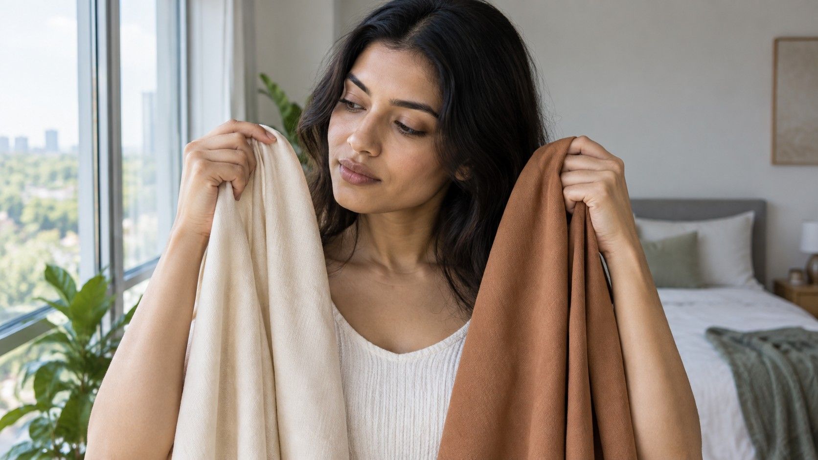
Fabric draping is the most practical color analysis test because it replaces theory with side-by-side evidence. Stand near a window in daylight, without direct sun striking one side of the face. Remove tinted glasses if you wear them, pull hair away from the forehead, and use a plain mirror. Makeup is optional, but heavy contour or a very bright lip can make subtle comparisons harder to read.
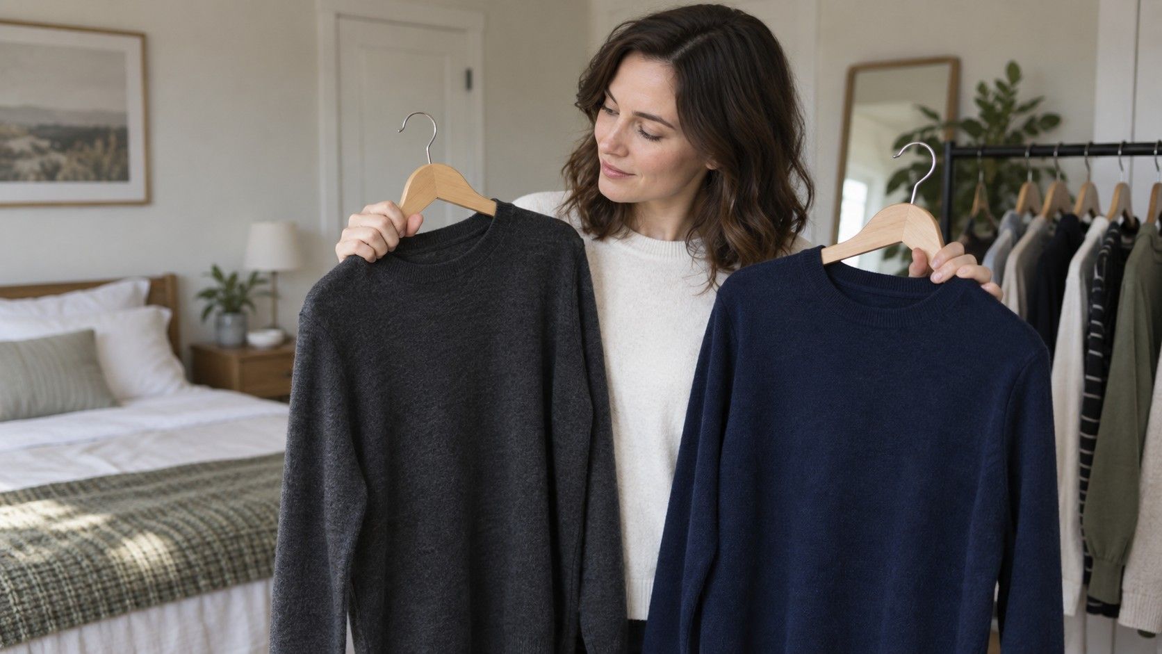
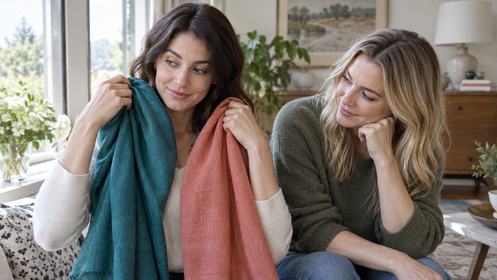
Choose pairs that ask one question at a time: cream versus optic white, rust versus berry, camel versus charcoal, bright turquoise versus smoky blue. Hold each fabric, shirt, towel, or paper near the jawline for a moment. Do not look only at whether the color flatters the garment itself. Look at the under-eye area, the shadows around the mouth, the evenness of the neck, and whether the eyes look present or distant.
Take short notes rather than trying to remember everything. A winning color usually makes several small things easier at once: the face looks clearer, the eyes are more visible, and you do not feel compelled to add more makeup to balance the outfit. A losing color may emphasize a sallow cast, dark circles, or blotchiness. One comparison can be misleading, so repeat the test on a different day and in another neutral room.
It helps to use real clothing after the first round. Flat paper can show temperature, but texture and scale matter in a wardrobe. A fine knit in a muted blue may work where a glossy satin version feels too cold. A warm brown coat can be excellent even if a warm yellow T-shirt is not. The test should refine your choices, not reduce them to a tiny handful of approved swatches.
Why app results need a second check
A camera-based result can be useful for suggesting directions to test, but a photograph is not a neutral instrument. Phone cameras adjust white balance, exposure, contrast, and skin smoothing automatically. Window light changes from morning to late afternoon; a pale wall can bounce cool light onto the face, while a warm bulb can add yellow where there is none. A photo taken after sun exposure may also reflect temporary surface color rather than a stable undertone.
For a more useful image, face indirect daylight with no colored light nearby, keep the camera at eye level, and include part of the neck. Avoid beauty filters, portrait blur, and a strongly colored top. Then treat any suggested palette as a hypothesis. Pull out two or three nearby colors you already own and compare them in the mirror. If the recommendation keeps winning in person, it has earned some trust. If it only looks convincing on a screen, keep experimenting.
There is also a common trap in reading a result too literally. A palette may say “cool,” but that does not mean every icy pastel will be satisfying. Someone might prefer cool colors with medium depth and moderate softness, or warm colors only when they are dark enough to echo hair and brows. The strongest information is often the direction of the result: softer rather than brighter, deeper rather than lighter, balanced rather than strongly warm.
Turning a palette into shopping choices
Start with the items nearest your face: tops, scarves, jackets, glasses, hats, earrings, and lipstick. These create the quickest feedback. If muted blue-green, soft berry, and charcoal repeatedly look good, they are more valuable than a long list of colors you may never wear. Build a short personal palette of four or five reliable shades plus two neutrals, and keep a photo of the group on your phone for reference when shopping.
Neutrals deserve extra attention because they occupy so much of a real wardrobe. Black, navy, chocolate, taupe, ivory, denim, gray, and olive all have many versions. Test them the same way you test a statement color. A person who finds pure black severe may love soft black, deep navy, or cool espresso. Someone who looks dull in beige may still thrive in a mineral gray, warm stone, or dark olive.
Use accents as experiments, not as a second uniform. A small bright bag, a patterned scarf, or a lip color can explore a different temperature or chroma without forcing a major purchase. Over time, repeat outfits will reveal what is truly dependable. Personal color analysis succeeds when getting dressed becomes simpler and more expressive, not when every enjoyable color is treated as a mistake.
If your observations seem mixed, that is normal. Natural coloring changes with hair color, tan, lighting, and personal style; many people sit close to the border between familiar categories. Keep the comparisons that make you feel alert and comfortable, revisit the uncertain ones later, and let a palette remain a working tool rather than a permanent identity.