A color test for clothes does not need a quiz, a new wardrobe, or a wall of paint chips. The most useful tests happen with tops, scarves, and outerwear you already own, because those are the items that reflect color toward your face. A few side-by-side comparisons can reveal which shades make an outfit feel settled and which ones require more effort from makeup, styling, or simply your patience.
Why tops are the best place to begin
Not every garment has the same effect on how color reads. A bright skirt or colorful shoes can be fun without changing the face very much, while a shirt collar, scarf, coat lapel, or sweater neckline sits close enough to influence the reflected light under the chin and around the eyes. If you want to know what color clothes look best on you, start with the pieces that create this near-face frame.
That is also why an outfit can contain a color you love even when it is not your easiest color in a top. A difficult yellow may work as trousers, a bag, or a small print. A black blazer may be practical, while a softer navy or charcoal shirt underneath prevents the whole look from becoming too severe. The aim is not to ban colors. It is to understand placement so you can use them with more control.
Begin in indirect daylight near a window. Direct sun creates deep shadows and can turn a warm color test into a test of glare. Warm ceiling bulbs can push nearly every fabric toward yellow, while cool office lighting may make skin look gray. A calm window-lit spot, no beauty filter, and a plain mirror are enough. If you take photographs, use them as notes after looking in the mirror, not as the only judge.
Run a color test with pieces you own
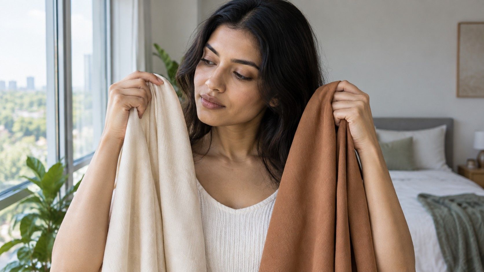
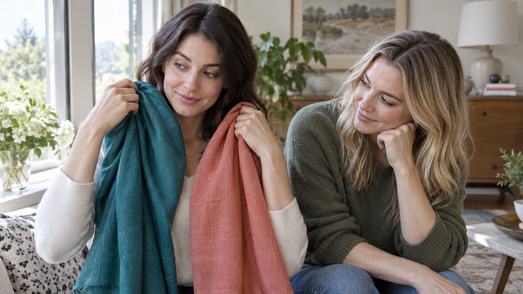
Gather six to ten near-face items: a few neutral tops, one or two dark colors, a light color, a clear bright color, and at least two softened shades. Scarves, towels, pillowcases, and fabric remnants work if you do not own enough variety. Keep the fabrics large enough to reflect light upward. A small swatch held at arm’s length rarely changes the face enough to give a useful comparison.
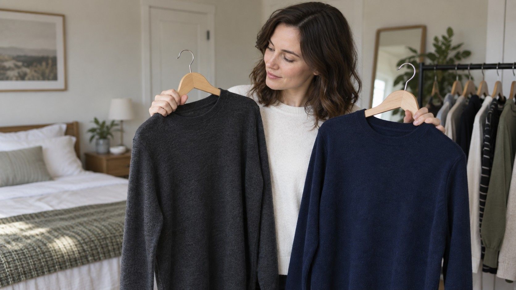
Test in pairs that answer one question at a time. Compare black with navy to test dark neutrals; cream with pure white to test light neutrals; dusty rose with fuchsia to test softness versus clarity; olive with emerald to test warmth and brightness. Hold each fabric under the chin for half a minute, look away, then return to it. This pause helps you notice an overall effect instead of reacting to the novelty of the garment.
Watch for concrete signs. A supportive color often makes the whites of the eyes look clearer, lets the mouth retain natural color, and keeps the jawline visible. A less useful one can make redness, under-eye shadows, or unevenness more apparent. Do not expect a dramatic transformation. The better fabric may simply make you look rested and familiar, while the weaker fabric looks like it arrived before you did.
Write down the result in specific terms rather than broad praise. “Soft navy better than black,” “muted berry better than clear pink,” or “warm cream better than optic white” gives you a usable record. Repeat a few comparisons on another day, especially if the first result surprises you. What colour clothes suit me quiz free results can be a starting idea, but repeated comparisons with real fabrics are much more reliable for building a personal palette.
Choose neutrals that support your palette
Wardrobe neutrals deserve more attention than accent colors because they are repeated in coats, knitwear, work clothes, bags, and shoes. A neutral should act as a calm background, not drain the face. Test blue-charcoal, soft navy, cool gray, warm gray, taupe, mushroom, camel, brown, cream, and white if you have them. You may find that the issue is not dark versus light, but the undertone or clarity of the neutral.
For example, someone may prefer deep colors but find black too abrupt near the face. Ink navy, graphite, espresso, or dark olive may provide the same practical depth with a softer effect. Someone who finds stark white clinical may look more at ease in soft white, stone, pearl gray, or a muted pale blue. These alternatives do not mean the original colors are forbidden; they simply offer better default choices for high-use garments.
Try neutrals with your usual makeup and without it. If a neutral only works with a very specific lip color or strong eye makeup, it may be an occasion color rather than an everyday foundation. If it works on a tired weekday and still feels good on a relaxed day, it is likely a dependable repeat piece. This small distinction prevents a color chart for clothes from becoming a wish list full of beautiful shades that do not fit your actual routines.
Build outfit contrast deliberately
Color harmony is partly about contrast, not just about warm and cool undertones. Contrast includes light against dark, clear against muted, and the difference between the clothing colors themselves. A person with softly blended features may feel overwhelmed by a sharp black-and-white graphic top, even if both colors are individually wearable. A person with strong hair-to-skin contrast may find that all-medium, low-contrast outfits look unfinished until one deeper element is added.
Test contrast by changing only one part of an outfit. Wear a medium neutral top with a dark jacket, then exchange the jacket for a softer medium-depth one. Try a muted scarf, then a clear scarf in the same color family. Notice whether the face stays visible or whether the clothing becomes the first thing you see. There is no requirement to match your natural contrast exactly; the point is to know when a stronger combination looks intentional and when it steals attention.
Patterns deserve the same attention. A print can be much higher contrast than any single color in it. If graphic stripes, small black-and-white checks, or very bright florals feel busy near the face, look for prints with related values, softened edges, or a dominant neutral background. Conversely, if muted outfits feel too quiet, one controlled contrast element such as a darker collar, a clearer lip color, or a deeper earring can add definition without replacing the whole palette.
Shop with a short color checklist
Before shopping, turn your observations into a compact checklist. Choose three or four reliable near-face neutrals, four to six accent shades, and a few colors that work better away from the face. Add notes about depth and finish: dark softened navy, medium cool gray, muted berry, warm olive, clear red only with makeup. This is more useful than a giant palette because it helps you compare a garment with pieces you already wear.
At the fitting room, move the garment into daylight if possible or stand near the brightest neutral light available. Hold it close to the face and ask the same questions you used at home. Does it make the skin look even? Does it support the eyes? Is the color wearable without a special workaround? Check whether it pairs with at least two existing bottoms or layers. Repeat outfits are the real test of whether a color earns space in the wardrobe.
Leave room for preference and occasion. A color that is not your strongest technical match can still be worth wearing if it makes you happy, suits an event, or works in a lower-impact garment. The value of color analysis is not restriction; it is fewer disappointing tops and faster decisions when a rack is full of almost-right shades. Over time, your list will become more accurate because it comes from clothes you actually wore, not from a single verdict about what color clothes look best on you.