An online skin colour check can make a vague question feel manageable, especially when you are choosing clothes, makeup, or hair colour. Its useful role is to give you a few directions to investigate, not to deliver a final identity from one image. Light, camera settings, and the colours around you can alter a photo enough that a calm second check is usually more valuable than a more complicated result.
Skin colour, skin tone, and undertone are not interchangeable
People use skin colour, skin tone, shade, and undertone as though they mean the same thing, but each describes something different. Skin tone usually refers to visible depth and surface appearance: lighter, medium, deep, tanned, rosy, or golden. It can change with season, sun exposure, skincare, and uneven areas of the face. A description of skin tone is useful when matching a base product or talking about how much light or dark contrast a clothing colour creates.
Undertone is the less obvious temperature or direction beneath the surface: commonly warm, cool, neutral, or olive-leaning. It is not a medical category, and it does not put anyone into a fixed set of colours. A warm-looking tan can sit over a neutral or cool undertone; visible redness does not automatically mean cool; and olive skin can appear golden, gray-green, or neutral depending on light. That complexity is why a digital result should be read as a clue rather than a conclusion.
A palette adds another layer. Two people with a similar visible skin tone can prefer very different colours near the face because their hair depth, eye contrast, and tolerance for bright versus muted shades differ. If an online test suggests a direction, use it to choose comparisons: cream against optic white, dusty blue against clear cobalt, or muted terracotta against orange. The useful question is not only what your skin is called, but what happens when a specific colour meets your face.
Prepare a photo that is worth comparing
Choose indirect window light, with the window in front of you rather than behind you. Overcast daylight or a bright shaded spot is often easier than direct sun because it softens harsh shadows. Turn off nearby lamps before taking the photo. Mixed lighting is a common reason a face looks peach in one image and gray or yellow in the next, even when the person has not moved.
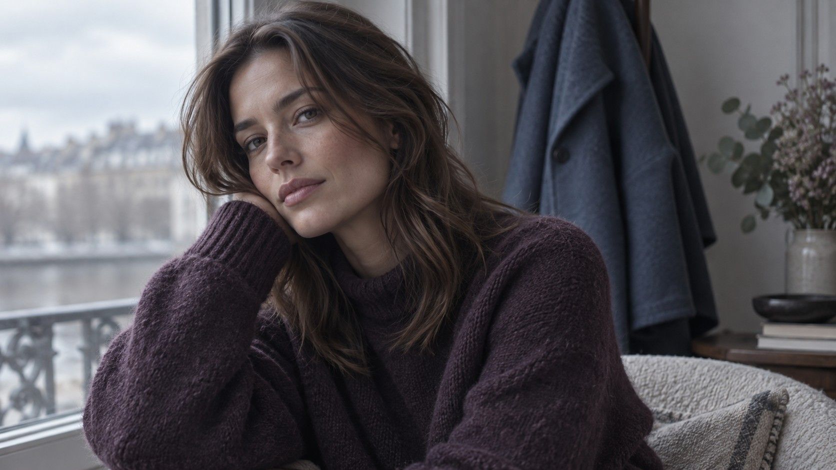
Take the image without makeup if you can, especially without foundation, bronzer, colour-correcting primer, tinted sunscreen, or a strong lip colour. Pull hair away from the jawline and remove coloured glasses. Include the neck and a little of the upper chest in the frame; the centre of the face may be redder or darker than the skin that will actually meet a shirt collar. A no makeup photo is not about looking a particular way. It simply removes a variable from the comparison.
Keep the background quiet and avoid a bright coloured top. A soft gray, faded blue, or ordinary off-white shirt is better than neon, black, or a saturated print for the initial image. Phones adjust white balance according to what fills the frame, so take three shots from the same place and look for consistency. If the results vary wildly, improve the setup before trying to interpret the image.
Read an online result as a starting point
Most online tools inspect pixel colours or ask you to compare a photo with a set of examples. Neither method sees the full person in changing light, and neither can know which shades you enjoy wearing. A result such as neutral, warm, cool, or olive is therefore most useful as a small hypothesis. It can suggest that you test cool gray versus warm taupe, or that you try softened colours before judging whether bright ones are too strong.
Be careful with precise-looking labels. A screen can make a category feel scientific simply because it has a chart, a percentage, or a named palette. Precision in the display is not the same as precision in the input. Phone cameras add processing, screens have their own colour temperature, and uploaded photos may be compressed. The more exact the result sounds, the more important it is to ask whether the original lighting actually supported that level of certainty.
Use the result to generate practical experiments instead of replacing them. If it suggests neutral undertone, test both silver-toned and yellow-gold metal near the face, then compare soft warm and soft cool fabrics of similar depth. If it suggests olive, try muted greens, dusty rose, and balanced neutrals rather than assuming every yellow or every green must work. A pattern across several comparisons is stronger than a single online reading.
Verify it with real fabrics
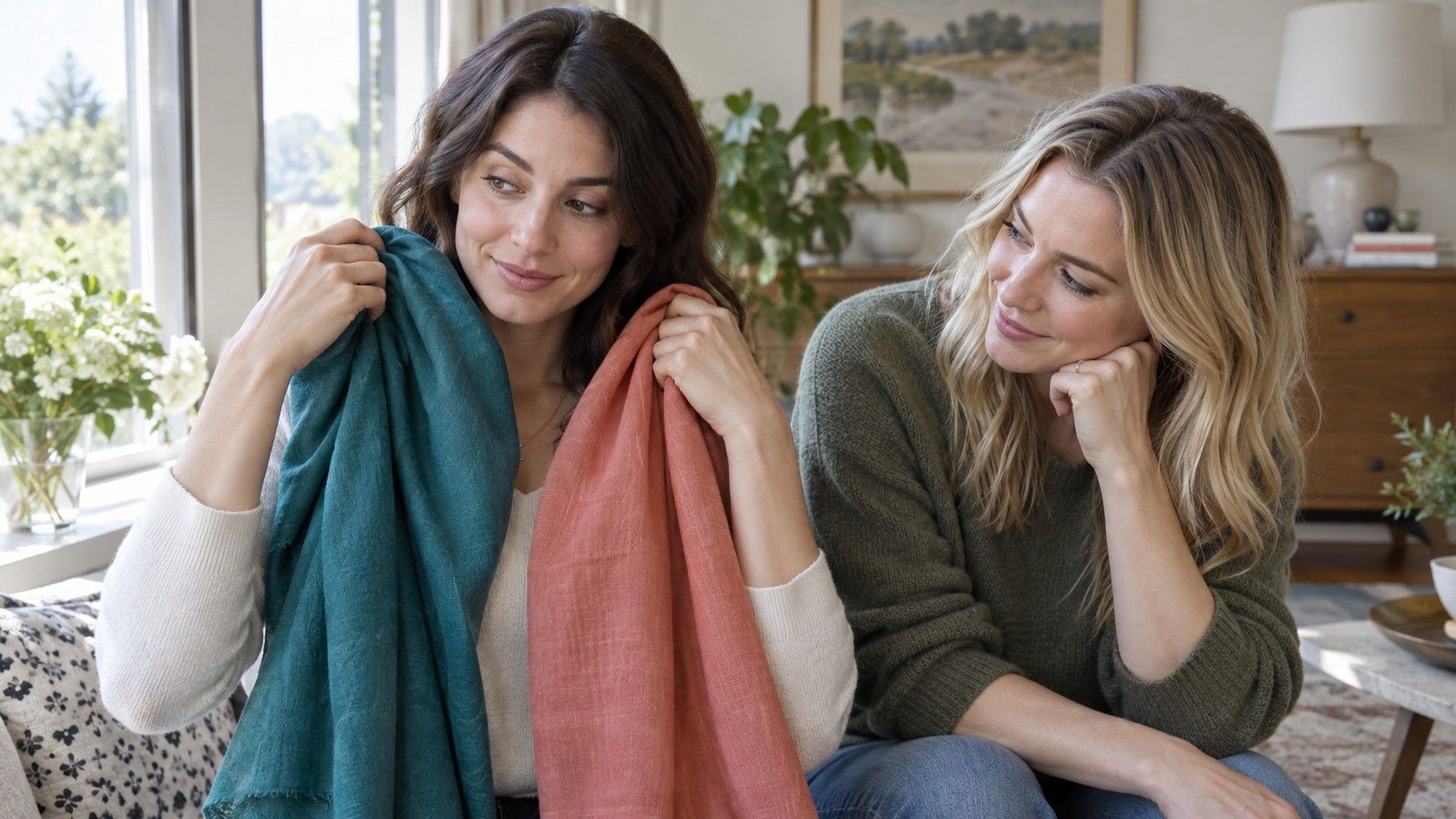
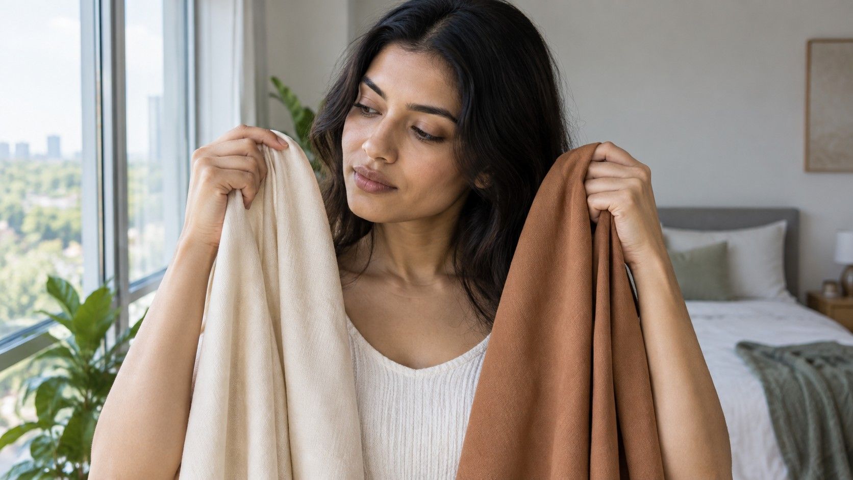
Real fabric shows more than a screen swatch can: texture, shine, scale, and reflected colour all affect the face. Stand near the same window and hold two fabrics beneath the chin. Begin with pairs that differ in just one main quality. Compare cream with stark white, charcoal with chocolate brown, blue-red with orange-red, or soft sage with yellow olive. Similar-value pairs make it easier to notice temperature without confusing it with lightness.
Watch the face rather than the garment. One colour may make dark circles, redness, or texture seem more prominent; another may allow the eyes and lip colour to look more distinct. Do not expect a dramatic transformation every time. An easy colour often simply makes the complexion look settled. Make a note of choices that feel easy, choices that feel difficult, and choices that remain uncertain. The uncertain group is worth revisiting in different daylight.
Try the same exercise with a white shirt or scarf as a reference, but do not assume that every white is neutral. Optical brighteners and warm fabrics can shift its appearance. The point of the reference is consistency, not proof. When an online check, a mirror comparison, and several outfits all point in a similar direction, you have enough information to choose better near-face colours without needing a permanent label.
Avoid the most common lighting traps
Warm indoor bulbs are the obvious trap, but cool bathroom lighting can be just as misleading. One can exaggerate yellow and orange; the other can add blue-gray shadows. Strong direct sunshine creates another problem by whitening highlights and darkening the opposite side of the face. A photo taken in a car may be affected by tinted glass, dashboard reflections, and bright sky. It can be a lovely picture and still be poor evidence for a skin colour test.
Do not compare photos taken in different rooms, on different days, or with different filters. A selfie from a restaurant, a passport-style image, and a bedroom mirror photo may all be accurate records of a moment, yet they are not a controlled set. If you want to compare them, first ask what changed: lamp colour, exposure, hair colour, tan, makeup, camera model, or background. Often the contradiction is in the setup rather than in your skin.
Finally, leave room for a flexible answer. You may find that soft blue, muted berry, and cream are reliable while pure black and bright orange need more styling. That is already a useful result. Checking your skin colour online should make everyday choices clearer, not persuade you to ignore your mirror, your comfort, or the colours that make you feel most like yourself.