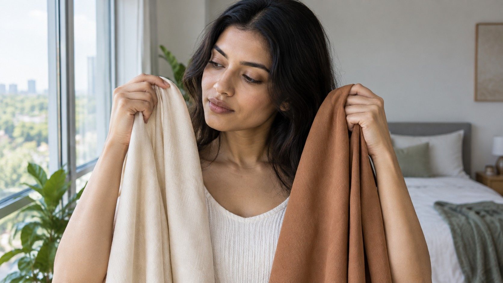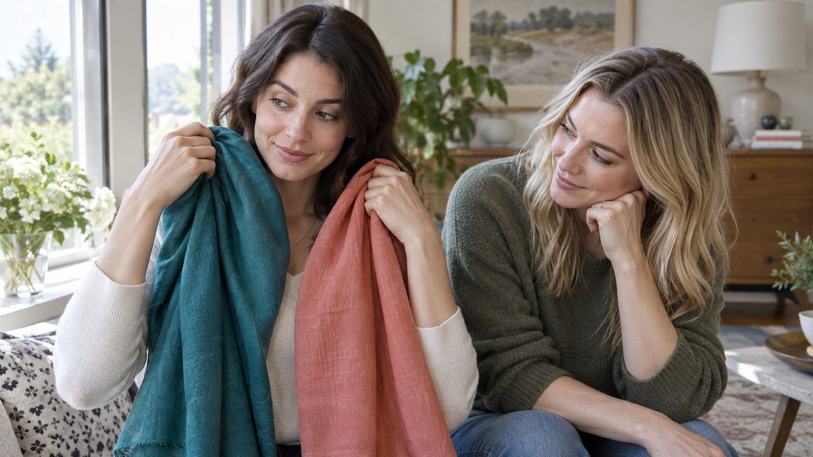
The question “what colors look good on me?” sounds as if it should have a short answer and a neat palette of swatches. In real life, the useful answer is a pattern you can notice: which colors make your face look clear, which create easy contrast, and which keep pulling attention toward shadows, redness, or the garment itself. You can find that pattern with clothes you already own.
What people mean by a flattering color
A flattering color is not necessarily the color that makes you look brighter, younger, or more dramatic. Those words can mean different things to different people. More often, a useful near-face color lets the features remain visible without making the skin look unusually gray, yellow, red, or washed out. You may still prefer a less conventional color because it feels expressive. Personal style and color harmony are related, but they are not the same decision.
Start by thinking about location. A vivid skirt has a different effect from a vivid sweater, scarf, jacket collar, or pair of glasses. Colors close to the face interact with skin tone, eyes, teeth, hair, and shadows under the eyes. A shade that feels difficult in a high-neck top might be excellent in trousers or a bag. This is why a wardrobe rule based on one bad blouse can become unnecessarily restrictive.
It also helps to separate color family from color behavior. Two blues can differ in temperature, color value, and saturation: one may be pale and smoky, another deep and clear. Saying “blue suits me” misses the detail that makes the observation reusable. A person who looks great in ink navy may not enjoy icy blue; someone who likes faded denim near the face may find electric cobalt overpowering. The question is less about a universal best color than about the version of a color that works for you.
Test color beside the face, not on a hanger
Use a mirror near a window in indirect daylight. Gather tops, scarves, towels, or fabric pieces in colors you are genuinely likely to wear. Hold each one just under the chin, with your hair pulled back if it usually falls over the collar. A hanger test is tempting because it is fast, but the garment is too far from the face to show the relationship you are trying to observe.
Compare two items at once whenever possible. Put soft white beside cream, dusty rose beside bright fuchsia, olive beside cool sage, or charcoal beside black. Similar pairs are more informative than wildly different ones because they reveal one variable at a time. Look at the eyes, the area around the mouth, and the natural shadows under the cheekbones. The better color often makes the face look more even without becoming the loudest thing in the room.
Give each comparison a simple note: easy, uncertain, or difficult. You do not need a verdict in the moment. If a color makes you pause because the face looks calm but not dramatically transformed, it may be a reliable everyday shade. Repeat your three most uncertain pairs on another day. Weather, fatigue, and indoor light can change your perception, so a mirror test is stronger when it produces the same result more than once.
Notice temperature, value, and softness
Temperature is the familiar warm-versus-cool question. Warm colors lean toward yellow, orange, or golden red; cool colors lean toward blue, blue-red, or blue-green. Yet temperature rarely works alone. A cool berry can be too intense, and a warm camel can be too light, even if their general temperature is plausible. Treat warm and cool as one dial rather than a complete color identity.
Color value is the lightness or darkness of a shade. If your natural face contrast is gentle, very deep black or very pale icy colors may take over the picture. If your hair, brows, and eyes create stronger contrast, medium shades can sometimes feel vague while deeper colors create a cleaner frame. This does not mean matching clothing to hair color. It means testing whether the garment supports the amount of light-dark contrast that already exists near your face.
Softness describes whether a color is muted and grayed or clear and bright. Many people who believe they have the wrong undertone are reacting to saturation instead. A bright warm orange and a dusty terracotta are both warm, but they can produce entirely different results. Try a softened version and a clear version of the same family. When muted colors make the skin appear smoother and clear colors create extra shadows, that is a useful direction for future choices.
Use photographs without being fooled by them
Photos are useful for slowing down a comparison, not for delivering a final answer. Take them in the same daylight setup, without beauty filters, portrait smoothing, or a screen set to extreme warmth. Frame the face and collar area, and keep the camera distance consistent. A phone’s white balance can shift when the garment fills more of the frame, so take one photo with each color and one wider photo that includes both.
Do not judge only the tiny image on the camera screen. Transfer the photos to one screen, view them at the same brightness, and compare them next to each other. Look for repeatable effects: does one shade make your lips look less defined, does another make the whites of the eyes seem clearer, or does a particular neutral turn the jaw area flat? If the effect changes dramatically between screens, rely more on the mirror test than on the image.
Photographs can be especially misleading with red, orange, violet, and green because cameras compress or exaggerate those hues differently. They also react to colored surroundings. A beige wall may make a cool top look bluer; plants near a window can throw green light onto skin. Keep the photo as a record of the experiment, but let real fabric in neutral daylight have the final word.
Make a short reliable-color list
After several comparisons, write down five colors that repeatedly felt easy near your face. Include two neutrals, two colors, and one shade you enjoy even if it is less obvious. A short list is more useful than declaring an entire season or banning half the color wheel. It gives you a practical filter for tops, coats, scarves, makeup, and hair accessories without turning every purchase into a color-analysis project.
Add a few notes about the versions that work. Instead of “green,” write “soft moss and muted teal, not neon green.” Instead of “red,” write “blue-red and muted brick, avoid very orange scarlet near the face.” These descriptions preserve the temperature, value, and softness that created the result. They also make room for a color to work differently in a print, where neighboring shades can soften or sharpen its effect.
Revisit the list when your hair color changes, your tan fades, or you find a garment that surprises you. Your preferences may evolve, and lighting always changes the appearance of fabric. The goal is not to discover a permanent answer to what colors suit you. It is to build enough visual evidence that getting dressed becomes easier, while you still have freedom to choose colors for mood, occasion, and sheer enjoyment.