A phone photo can be a useful starting point for a skin undertone test, but it is not a tiny laboratory. Cameras make quick decisions about light, brightness, and color before you ever look at the image. The best use of a photo is to narrow down a few possibilities, then compare them with what you see in a mirror and with real colors near your face.
Undertone is different from surface skin tone
Surface skin tone is the color that is easiest to notice first: fair, medium, deep, tan, rosy, golden, or temporarily darker after time outdoors. It can change with sun exposure, irritation, makeup, and the room you are in. Undertone is the quieter direction beneath that visible surface. People often describe it as cool, warm, neutral, or olive, although no single word captures every complexion.
A cool undertone may sit more comfortably beside blue-based pink, berry, charcoal, or crisp white. A warm undertone may look at ease with cream, tomato red, olive, coral, or warm brown. Neutral undertone skin can borrow from both directions, but usually has limits: one very icy or very yellow shade can still make the face look tired. These are working observations, not rules about what someone is allowed to wear.
The camera cannot see undertone in isolation. It records reflected light bouncing off skin, nearby walls, clothing, and the phone itself. Redness around the nose, a tan on the forehead, dark circles, or a green cast from a tree outside can all become more prominent than the underlying color relationship you are trying to judge. That is why a skin tone test camera result needs context before it becomes useful.
Why phone cameras shift color
White balance is the main reason a photo can seem to change your complexion from one minute to the next. Under a warm lamp, a phone often adds blue to make the room appear neutral; under a blue-gray window, it may add warmth. The adjustment can be pleasant for a casual picture while being unhelpful for undertone analysis. Two photos taken seconds apart can differ if the camera recognizes a new part of the scene.
Exposure creates another trap. When a face is underexposed, shadows can make skin appear cooler, grayer, or more olive than it is in person. When it is overexposed, delicate pink, peach, or golden variation disappears and the photo may look flat. Portrait mode, beauty filters, automatic HDR, and screen brightness add more moving parts. Turn off filters and use the plain rear or front camera consistently rather than comparing several edited versions.
The room matters as much as the device. A yellow wall, a dark green curtain, a red sweater, or a mirror with a warm tint can throw colored light onto skin. Even a white shirt is not always neutral if it has been washed with optical brighteners or photographed in a dim room. A camera is better treated as a record of one lighting setup than as an authority on the color of your skin.
Set up a more reliable photo
Choose indirect daylight near a window, ideally when the sun is not blasting directly onto one side of your face. Face the window rather than standing with it behind you. A bright overcast day is often easier than sharp midday sunshine because the light is broad and less contrasty. Avoid mixed light: switch off nearby lamps, especially warm kitchen or bedside bulbs, before you take the picture.
Use a bare face if possible, or at least skip foundation, tinted sunscreen, bronzer, and color-correcting products for this comparison. Pull hair away from the jawline and remove strongly colored glasses. Frame your face, neck, and a small amount of upper chest in the same shot. The neck comparison matters because the center of the face can be redder, darker, or more uneven than the skin that clothing colors will visually meet.
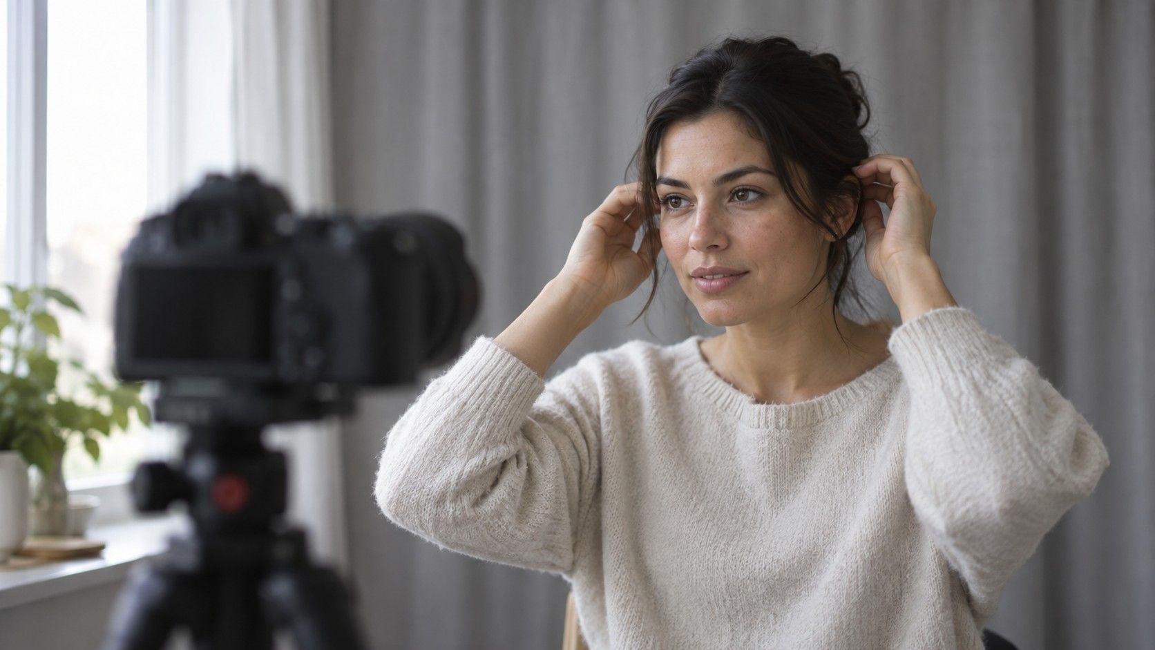
Take three or four photos without changing location, then look at them on the same screen. Include one with a plain off-white or soft gray item near the face and one with no fabric at all. Do not chase a perfectly blank backdrop; the goal is consistency. If every image shifts from peach to gray to yellow as you move a few inches, that tells you the setup is unstable, not that your undertone is unusually complicated.
Cross-check with fabric and metal
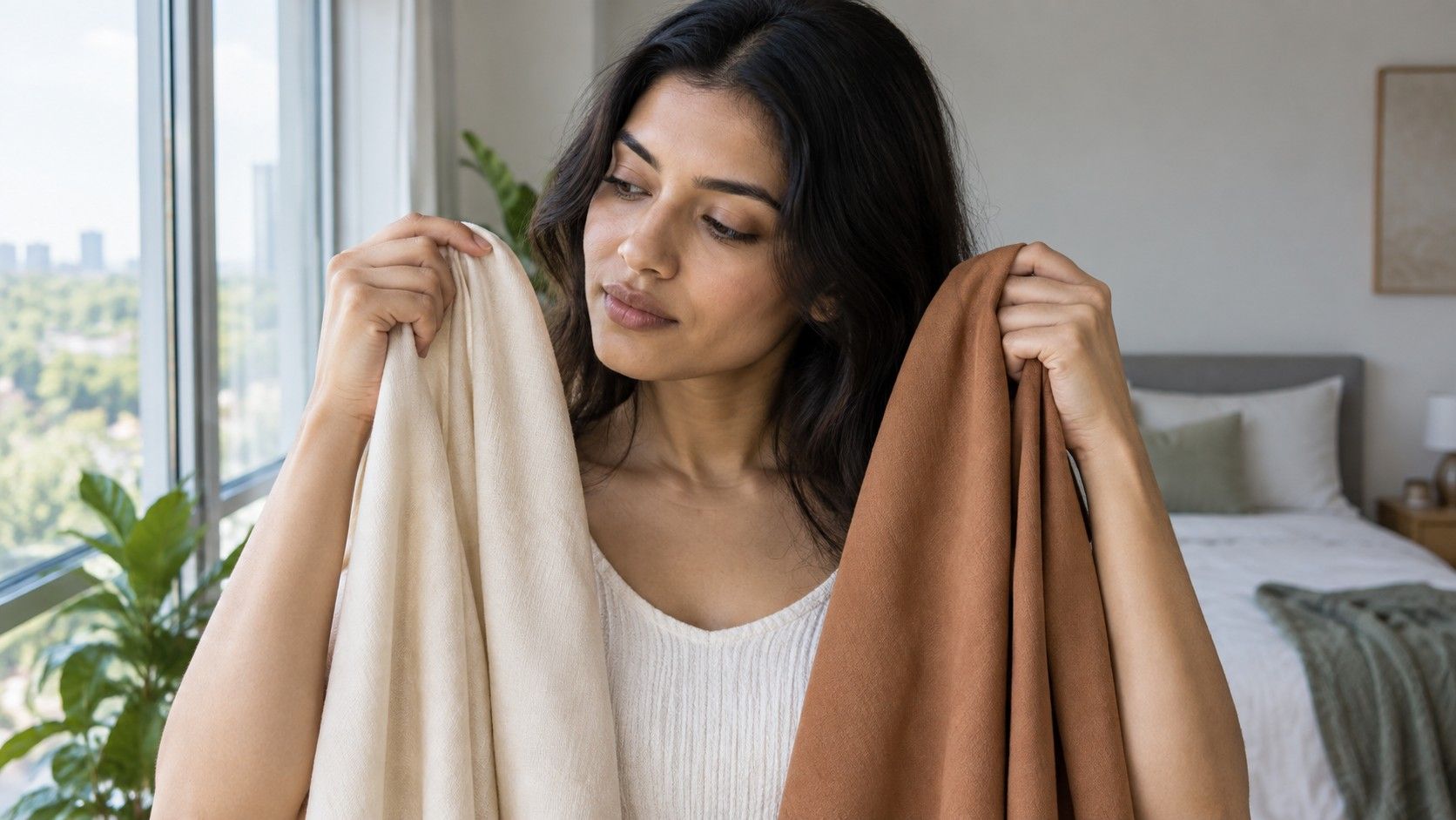
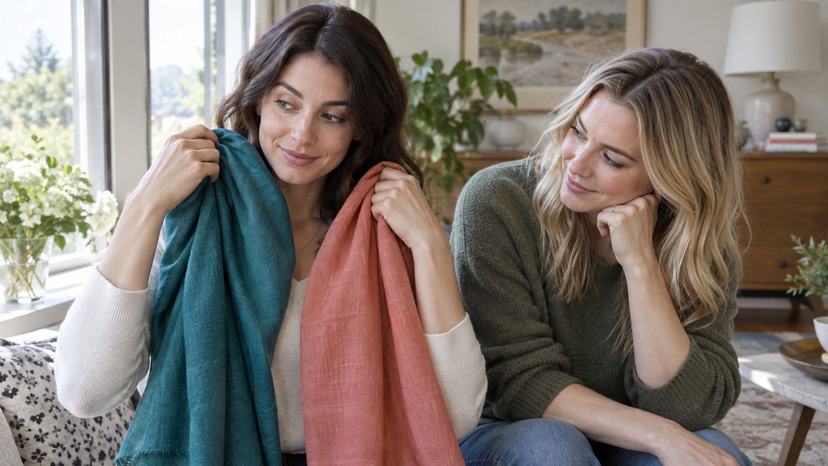
Fabric comparison is usually more revealing than staring at a cropped selfie. Hold two similar-value colors under your chin: for example, optic white and cream, cool raspberry and coral, charcoal and warm chocolate, or blue-red and orange-red. Look for the effect on the face rather than whether you like the fabric. One option may make shadows around the mouth look stronger, bring out redness, or separate from the skin in a harsh way. The other may make the complexion appear calmer or the eyes more distinct.
Keep the comparison fair. A pale cool pink and a deep orange do not test only temperature; they also differ in brightness and depth. Start with colors that have roughly the same lightness, then repeat on another day. A mirror in window light is best for the final call, while the photo can preserve what you tested. If you ask a friend for an opinion, show the two colors side by side instead of asking them to name your undertone from memory.
The jewelry test can add a clue but should not decide the question alone. Try silver-toned metal, yellow gold, and a mixed or muted finish near the face. Skin can look good with several metals because shine, scale, and styling matter. What is useful is the pattern: if soft silver, pewter, and cool gray repeatedly look easier than bright yellow gold, that supports a cool or neutral-cool direction. If neither extreme works, a neutral or olive-leaning palette may deserve more testing.
When the result is simply inconclusive
An inconclusive result is normal, especially under changeable weather, with a new phone, or when the colors you tested were too different in more than one way. It can also happen because a person sits near the center rather than at the far warm or cool end. There is no prize for forcing a warm undertone or cool undertone label when your best colors include a mixture of both.
Instead of repeating the same photo test until it feels decisive, keep a small observation list for a week. Note which scarf, collar, lipstick, or earring made you look rested in ordinary daylight. Notice whether black feels dramatic but heavy, whether ivory is easier than stark white, or whether muted shades work better than clear bright ones. Color value and saturation can be the real issue even when temperature gets most of the attention.
Use the camera result as a hypothesis: perhaps you lean neutral-cool, perhaps muted warm colors are better than bright warm colors, or perhaps the neck and face need separate consideration for foundation. Then test one practical choice at a time. That approach produces a wardrobe and makeup palette you can repeat, while leaving room for taste, lighting, and the fact that a photograph only captures one small version of you.