A skin tone test can be useful when you want to choose a foundation shade, understand why certain clothing colours feel off, or describe your colouring more clearly. It becomes confusing when it promises more than a quick comparison can show. Skin changes with light, sun exposure, makeup, and camera settings, so the best result comes from observing several areas in neutral daylight and separating visible depth from undertone.
What a skin tone test is really identifying
In everyday beauty and style language, skin tone usually describes the visible depth and surface appearance of the skin: light, medium, deep, and the many variations between. Melanin contributes to that visible depth, but it does not create a short list that captures every person. Freckles, redness, pigmentation, tan, and the amount of light in a room can all change what the eye notices first.
Undertone is a different idea. It refers to the more stable colour direction seen beneath the surface: often described as warm, cool, neutral, or olive-leaning. These words are useful for comparing clothing and cosmetics, but they are not medical categories and they do not replace the way your own skin actually looks. A person can have deep skin with a cool undertone, light skin with a warm undertone, or a medium depth with an olive or balanced appearance.
A worthwhile test asks modest questions. What depth does my jawline appear under daylight? Does the neck look lighter, darker, more golden, rosier, or more muted? Do warm and cool fabrics change the overall balance? The answers can guide a colour choice. They do not need to produce an exact label before they become useful.
Be cautious with charts that present a row of swatches as though every real face will match one square. Charts can help communicate a general depth range or compare foundation families, but screen brightness, printing, and brand formulas shift their colours. Use a chart as a reference point, then return to your own reflection in ordinary light.
Why your face and neck may look different
The face is exposed to more than the neck. It often has more sun exposure, skincare, makeup residue, flushing, and temporary irritation. It may appear darker after a holiday, redder after exercise, or more uneven after a day indoors with dry air. The neck is usually less affected, which is why it is often a steadier place to compare foundation or near-face clothing.
That does not mean the neck is the only truth. A foundation that matches the neck but leaves the face looking flat can still feel wrong, particularly if the chest and shoulders have a different depth. Look across the jawline, neck, and upper chest in the same light. You are trying to find a harmonious transition rather than force every area into one exact shade.
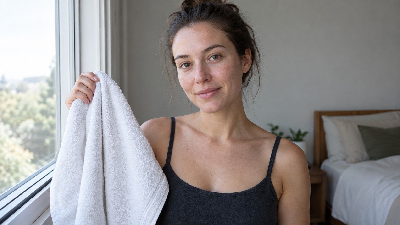
Hair and clothing can mislead the eye as well. A very dark collar makes skin appear lighter by contrast; a pale warm top may make it appear cooler. Bright lipstick can change how the face reads in a mirror, while a coloured wall can throw reflected light under the chin. For an initial skin tone test, wear a simple neutral top or drape a white towel around the shoulders so that the surrounding colours do not dominate.
Temporary changes are normal. Sun exposure can deepen the surface tone, and a new hair colour can make the whole face seem warmer or cooler by comparison. Rather than chase a permanent conclusion, note the conditions of your test. A useful description might be “medium visible depth in summer, balanced undertone, looks clearer in muted cool colours.” It leaves room for ordinary variation.
A simple daylight comparison
Choose a bright window with indirect daylight, not direct sun. Stand facing the light so one side of the face is not in heavy shadow. Turn off strong overhead lamps if they are warm or coloured, and avoid a room with saturated walls. Remove tinted glasses and, if practical, heavy foundation or bronzer. The goal is not to show bare skin perfectly; it is to reduce distractions while you compare.
First look at the jawline and neck together. Notice the visible depth without trying to name it immediately. Is the face substantially redder, darker, or more yellow than the neck? Then compare the neck with the upper chest or inside of the arm, knowing that those areas may receive different amounts of sun. You are looking for a range, not a single pixel-perfect match.
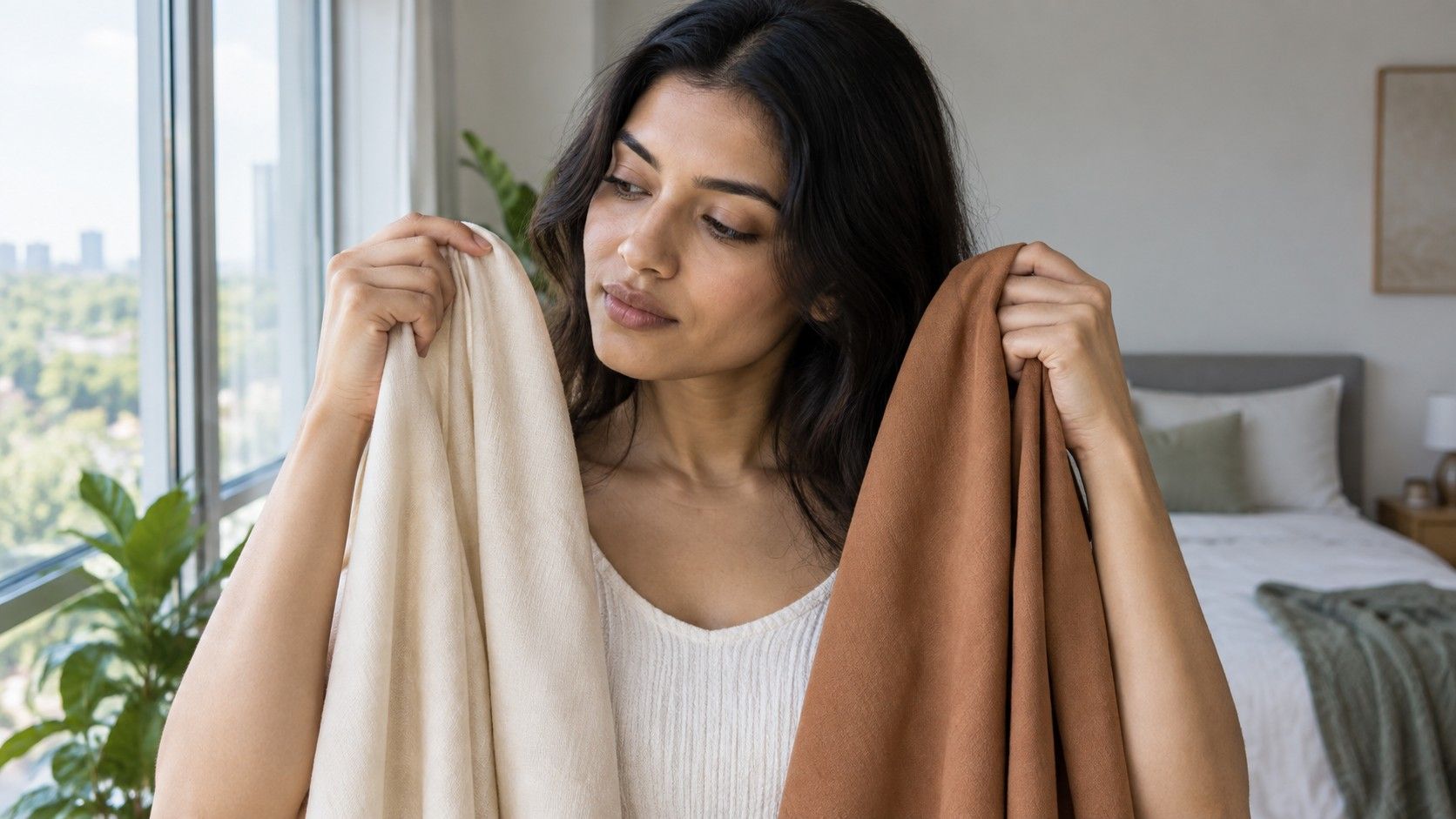
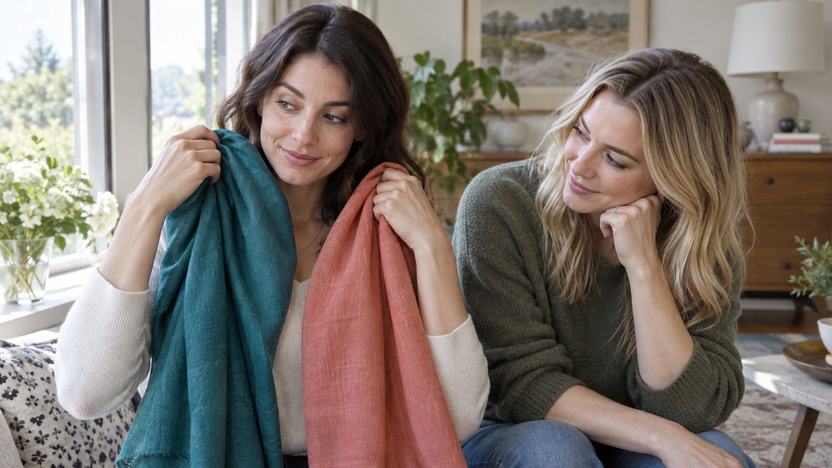
Next, hold neutral fabrics near the face: soft white, cream, medium grey, charcoal, and muted navy work well. Then add a warm-cool pair such as coral and berry or camel and cool taupe. A compatible direction tends to make the skin look more even and the eyes more visible. A difficult direction may exaggerate surface redness, grayness, or shadows. Repeat on another day before treating the outcome as dependable.
If you use a phone photo, make it a record rather than a verdict. Disable filters and portrait effects, face the same window, keep the camera at eye level, and avoid a strongly coloured background. Phones alter white balance automatically, so compare several photos taken under similar conditions instead of trusting one image. The mirror and fabric test remain the more direct check.
How to separate tone from undertone
Visible depth can change seasonally; undertone usually feels more consistent across the year. This is why a tan does not automatically turn a cool undertone warm, and fair skin is not automatically cool. Start with repeated fabric comparisons rather than vein colour or a single jewellery rule. Blue-green veins can look different through different skin depths, and many people enjoy both silver and gold regardless of undertone.
Warm-leaning skin often sits comfortably beside colours with golden, peach, olive, or orange influence. Cool-leaning skin may find blue-red, rose, violet, and blue-based tones easier near the face. Neutral skin can often borrow from both sides, but usually still has limits in brightness, depth, or saturation. Olive skin can be especially easy to misread because a green-gray cast may coexist with warm, cool, or balanced undertone clues.
Try not to use foundation oxidation as the only clue. Some formulas darken or turn orange after contact with oil and air, which says as much about the product as it does about your skin. Test shades along the jawline, let them settle for a while, and inspect them in daylight. A good match should disappear across the transition between face and neck rather than sit as a separate stripe.
For clothing, separate the questions even further. You might discover that cool colours are generally easier, but only at medium depth; or that muted warm colours work while clear orange does not. That is a useful result. It gives you a direction for choosing tops, scarves, glasses, and makeup without pretending that one word describes every colour you can wear.
Use the outcome for color choices, not a label
Once you have a rough sense of your visible skin tone and undertone direction, put it to work in small decisions. Begin with items near the face: tops, scarves, coats, earrings, lipstick, and glasses. These show the clearest effect. If a muted berry, soft navy, and charcoal consistently make you look awake, record them. If cream and warm brown work better than stark white and silver grey, record that instead.
Keep your list short at first. Two reliable neutrals, two colours you enjoy, and one accent are enough to test in real outfits. A compact personal palette is easier to refine than a huge chart. It also helps avoid buying a colour solely because it is supposedly right for a category, only to find that its brightness or fabric makes it feel unlike you.
Leave room for context. Colours worn away from the face have less influence, and a print can combine a difficult shade with several helpful ones. Makeup, hair colour, and personal preference matter too. A style choice does not have to be optimized to be worthwhile; the test is there to make choices more intentional, not to remove playfulness.
Revisit your observations when the light changes, after a major hair change, or when your wardrobe evolves. The most useful skin tone test gives you a clearer eye for comparison: what is surface colour, what is a lighting trick, and what consistently helps you feel like yourself. That is more durable than any rigid label.