A personal color test online can be a useful prompt to notice colors you have overlooked, but it is not a final reading of your face. A digital result depends on the photograph, the lighting, and the comparisons the tool is designed to make. The practical goal is not to collect a perfect seasonal label; it is to learn which color qualities make you look more like yourself in ordinary daylight.
What an online color test usually measures
Most personal color tests compare visible clues in a photo: the apparent warmth or coolness of skin, the depth of hair and eyes, and the amount of contrast between features. Some return a broad seasonal color analysis result, while others produce a palette of recommended shades. These are interpretations of pixels, not measurements of an unchanging personal truth. A phone camera records reflected light, then applies its own exposure and color processing before the image reaches the test.
That limitation does not make digital analysis useless. It simply tells you what kind of evidence it can provide. If several photos taken in good light repeatedly return a preference for soft cool shades, for example, that is worth testing with clothes. If one image says warm autumn and another says bright winter after a change of room, the disagreement is information too: lighting or styling is probably exerting too much influence for the label to be treated as settled.
Try to separate three questions that are often merged together. Undertone asks whether colors with warm or cool influence tend to harmonize near the face. Value asks whether light, medium, or deep colors feel proportionate. Chroma asks whether clear colors or muted colors are easier to wear. A single result may name a season, but the palette is more useful when it shows which of those three qualities it is responding to.
Choose a photo that does not undermine the result
An input photo is the largest factor you can control. Stand facing a window in indirect daylight, with the window in front of you rather than behind you. Direct sun can create strong yellow highlights and dark shadows; a cloudy window or a bright shaded area is generally easier to read. Keep the room’s overhead lights off when possible, since warm bulbs can make every complexion appear warmer than it is.
Use the rear camera if you can, and ask someone to take the picture from a comfortable distance. Front cameras often use smoothing, automatic brightening, or wider lenses that alter facial proportions and color. Turn off portrait mode, beauty filters, skin smoothing, dramatic HDR, and color effects. Wear little or no makeup for the comparison photo, and pull hair away from the face if it has strong highlights or a vivid dye color. A plain top in gray, off-white, or muted blue helps keep clothing from reflecting a competing color upward.
One photograph is not enough. Take two or three on different days or in different places with similar window light. If your skin looks distinctly different between photos, pause before reading too much into any personal colour test. You may also include the neck and upper chest rather than cropping very tightly around the face, because that gives a more balanced view of surface tone without relying on a single flushed cheek or a shadow under the eyes.
Read the palette before the season label
A label can feel satisfying because it turns uncertainty into a short answer: summer, autumn, winter, or spring. But labels are broad buckets. Open the palette and look for patterns instead. Are the suggested colors warm or cool? Mostly light or deep? Clear like cobalt and cherry, or softened like slate and muted berry? These patterns are easier to test and remain useful even if another test later gives you a neighboring season.
Look closely at the neutrals. A palette that favors charcoal, navy, cool taupe, and smoky brown is making a different claim from one that favors cream, camel, warm olive, and cinnamon. Neutrals are valuable because they appear near the face in coats, knitwear, jackets, and work clothes. If a recommended accent shade seems unfamiliar, you do not need to buy it; compare it with a similar scarf, towel, or fabric remnant first.
Pay attention to confidence level when it is shown, but do not confuse confidence with accuracy. It may only indicate how strongly a particular system favored one group over another. A modest confidence result can still give a useful direction, such as “try softer colors than you normally choose.” A very decisive result can still be distorted by a warm kitchen light or a photo with heavy makeup. Treat certainty as an invitation to verify, not a reason to stop looking.
Test the result with clothes you own
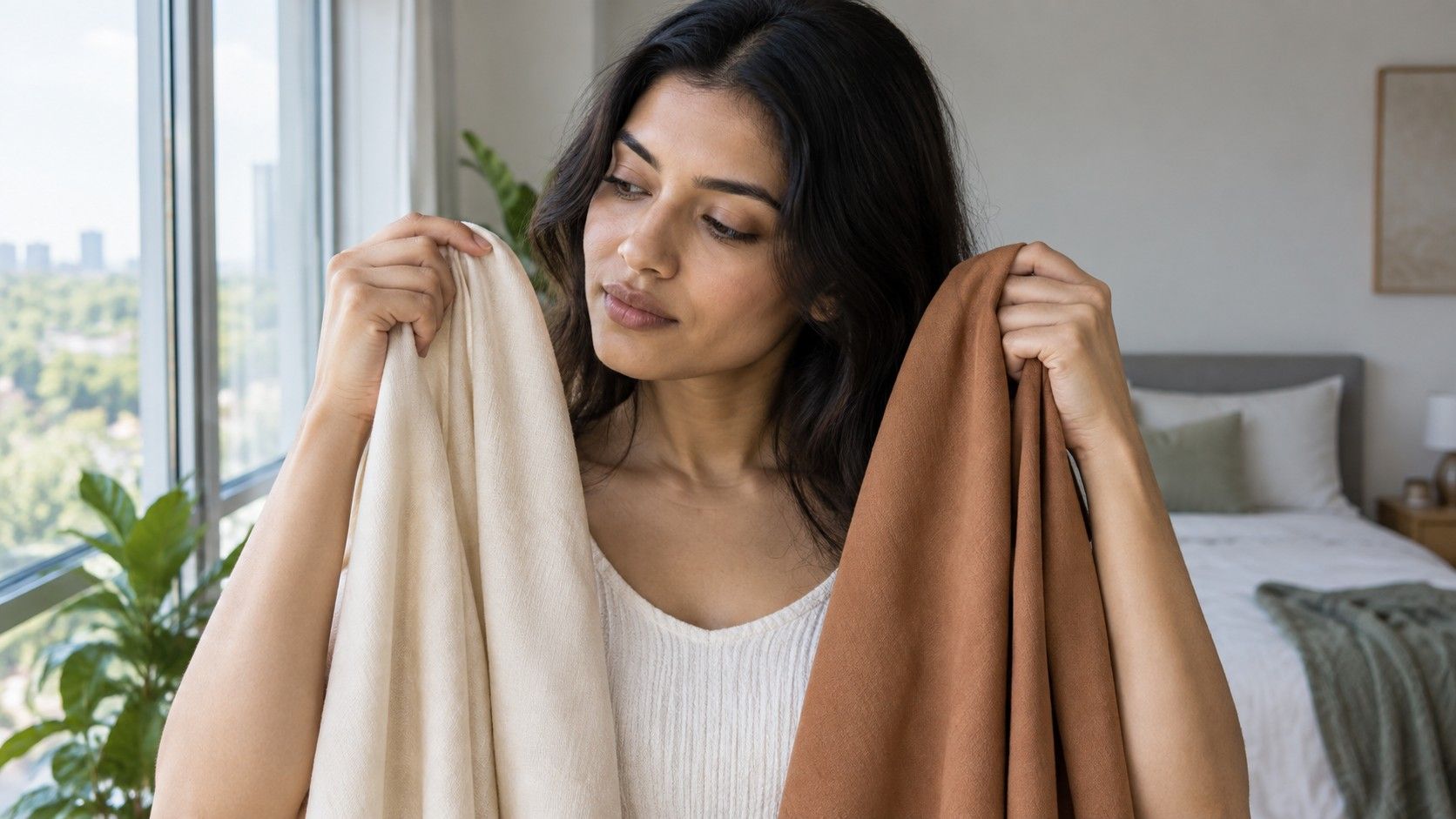
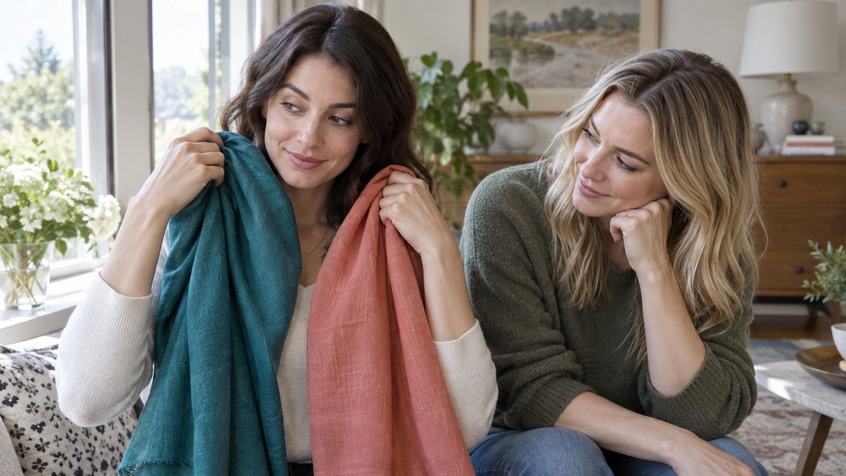
Color draping sounds formal, but it can be done with items already in your home. Gather two or three garments, scarves, towels, or pillowcases in contrasting color qualities. Place each close under the chin in the same daylight and keep the rest of the scene unchanged. Rather than asking whether you like the color, look at the face: do the eyes remain clear, does the jawline stay visible, and does the skin look even without appearing flat?
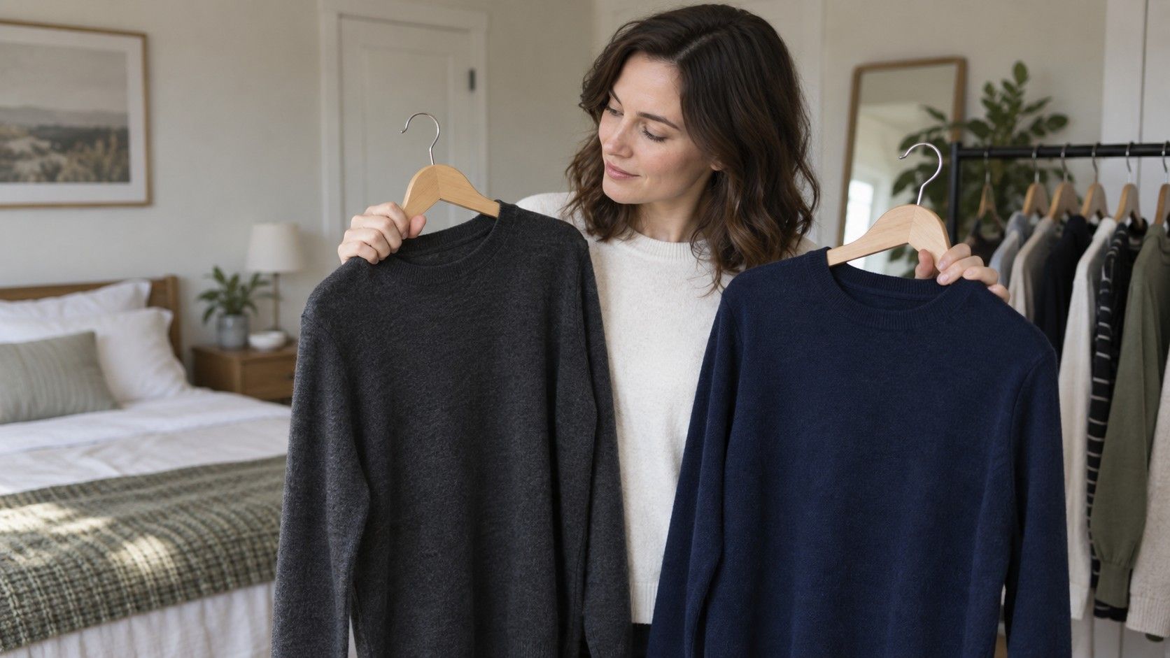
Make comparisons in pairs. A dusty blue against a bright royal blue tells you more than holding a single blue and hoping for a reaction. A soft berry against a vivid fuchsia, a deep navy against black, or cream against stark white can reveal value and chroma differences quickly. Photograph each pair with the same rear camera settings if you want a record, but examine the mirror first. Cameras may favor saturated color or shift white balance in ways your eyes do not.
Repeat the useful comparisons when you are tired, rested, bare-faced, or wearing your usual makeup. A color that works only with a particular lipstick is not necessarily wrong; it may simply belong in a more deliberate outfit. A color that looks comfortable in several ordinary situations deserves a place on your reliable-color list. This real-life test is more valuable than trying to force every garment into the palette from a personal color test online free of context.
Know when to retake the test
Retake a digital test when the original photo was taken under warm artificial light, in direct sun, with a strong filter, or after a major change in hair color. A new tan, fresh highlights, or a beard can shift visible contrast and may change which palette looks easiest near the face. That does not mean your underlying preferences have been erased; it means the styling context has changed enough to justify a new set of comparisons.
It is also sensible to retake the test when its output conflicts with repeated real-world observations. If an app calls you bright and high contrast, but vivid colors consistently make your skin look patchy while softened shades look calm, trust the repeated fabric test. Keep a note of what actually worked: deep muted teal, smoky rose, medium charcoal, warm cream, or whatever your comparisons show. Specific observations are harder to romanticize and easier to use while shopping.
A good result should reduce noise, not create a new obligation. Use it to make a short experiment list, then let daylight and your own wardrobe provide the evidence. Over time, you may find that you borrow from two neighboring palettes or that one trait, such as softness, matters more than a season name. That is a successful use of a personal color test: it helps you notice a pattern without asking you to live inside a label.