Olive skin tone is often described as a greenish cast, but that shortcut can be more confusing than helpful. Olive can appear fair, medium, or deep; it may look golden in summer, gray in winter, and quite different under a warm lamp. The practical value of recognizing an olive tendency is not finding a perfect label. It is learning which colours, metals, and base shades stop fighting the face in ordinary daylight.
Why olive is easy to misread
Olive is usually a relationship between visible skin depth and a muted green-gray, golden, or neutral cast rather than a single surface colour. It can be obscured by redness, freckles, a tan, acne marks, or a foundation that is not quite right. On fair olive skin, the cast may be subtle and show up mostly around the jaw, temples, or neck. On deeper skin, it may appear as a balanced, muted quality rather than an obvious green note.
Lighting makes this harder. Warm lamps can pull olive toward yellow or orange, while a cloudy window can emphasize gray and make the skin look cooler than it feels in person. A camera may compensate for a green wall, a blue shirt, or a warm background and change the face with it. This is why someone may receive warm, cool, and neutral answers from different photos without any one image being completely false.
Olive is also not the opposite of warm or cool. Some people have warm olive skin tone, some lean neutral olive, and some look more cool-muted. The labels describe different aspects of a complex appearance. Rather than trying to decide everything at once, observe what happens with matched colour pairs. The pattern is more useful than a label that sounds precise but does not help you choose a top tomorrow morning.
Fair, medium, and deep olive can share undertone clues
Fair olive skin is frequently mistaken for neutral because it may not look obviously golden or pink. It can also look slightly sallow beside a very yellow foundation or unusually gray beside an extremely pink one. The neck often provides a clearer clue than the cheeks, which can be flushed. Compare the face and neck in indirect daylight before deciding whether a surface redness is hiding a more muted undertone direction.
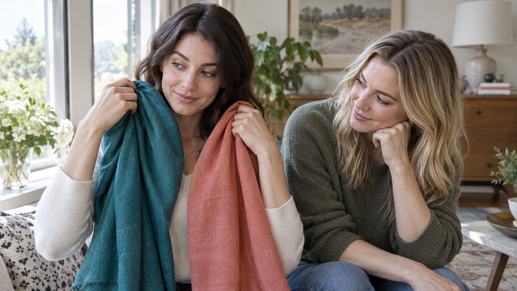
Medium and deep olive skin can show the same balancing effect in different ways. Very saturated yellow, orange, or lime may look louder beside the skin than expected, while muted teal, forest, berry, or balanced red can feel more settled. This is not a ban on bright colour. It is an invitation to test brightness and temperature separately. A clear jewel tone may work beautifully for one person, while another prefers the softened version of the same hue.
Across every depth, note whether colours make the skin appear clearer or simply create a striking contrast. Both can be attractive, but they answer different style questions. A pale olive complexion may look elegant in charcoal but overwhelmed by black; a deeper olive complexion may carry black easily and still prefer a softer near-face neutral for daytime. The aim is to identify repeatable effects, not to make skin depth dictate a wardrobe.
Colors that make olive skin look clearer
Muted colours are often a productive first test because they have enough gray or softness to meet an olive cast without competing with it. Try eucalyptus, muted teal, smoky navy, softened plum, dusty rose, burgundy, cocoa, or medium denim near the face. None of these is universally best, but each provides a useful comparison against highlighter yellow, intense orange, or very icy pastels. Notice which group lets your features remain visible without making shadows or redness seem stronger.
Neutrals deserve as much attention as statement colours. Instead of asking whether beige works, compare warm camel, mushroom taupe, soft white, cream, charcoal, and deep navy. The right neutral often becomes the foundation for a workable palette because it appears in coats, knitwear, shoes, and backgrounds for prints. A color that feels merely calm in a mirror can become invaluable once it is repeated across several outfits.
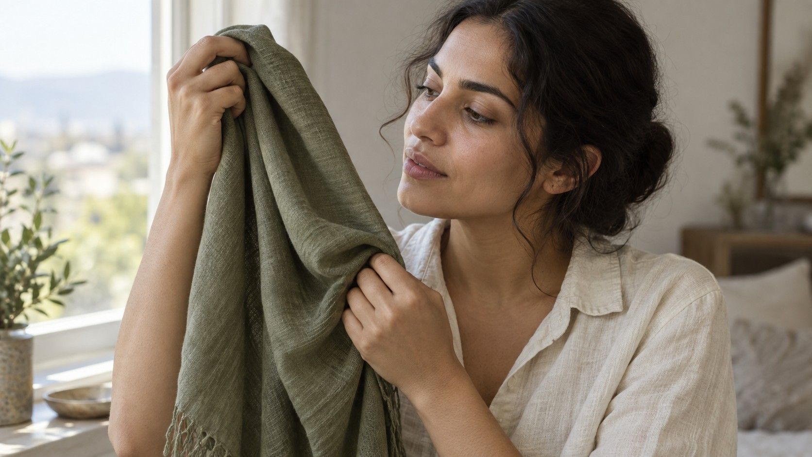
Do not assume green is automatically ideal simply because olive is associated with green. Acid green, bright chartreuse, and a yellow olive can be difficult, while cool pine, moss, slate green, or muted sea green may be easier. Similarly, some olive complexions love coral and warm red, while others find blue-red, berry, or faded brick more balanced. Build evidence with side-by-side fabrics rather than shopping from a fixed list.
How to test foundation and concealer safely
Foundation is a useful diagnostic tool only when tested carefully. Swatch several candidates along the jawline and extend each stripe slightly toward the neck. A shade that disappears into the cheek but creates a visible border at the neck is not truly matched. Give the swatches ten to fifteen minutes before judging, because some formulas oxidize and become warmer, darker, or more orange as they dry.
Test in daylight and avoid relying on a store mirror alone. Retail lighting often makes warm and cool shades appear closer than they are outdoors. If possible, photograph the jawline swatches in indirect window light without a filter, then compare that image with the mirror view. The photo is not a final authority, but it can reveal a strong orange, pink, or gray mismatch that is easy to overlook after staring at samples for too long.
Concealer does not have to be the same shade as foundation. Under-eye darkness, redness, and discoloration may need a different balance, so using a lighter or more peach-toned product in one place does not redefine your undertone. Choose products based on how they blend into the specific area and how they look after wear. If persistent irritation, sudden pigment changes, or a skin concern is the reason for testing, a beauty colour comparison is not a substitute for professional care.
Where seasonal palettes can help
A seasonal palette can be useful after you have noticed real preferences. It offers language for combining temperature, depth, contrast, and softness: perhaps deep muted colours feel easier than light clear ones, or perhaps warm medium shades are more successful than icy pastels. For olive skin, a palette is most helpful as an organising tool, not as a verdict about what one colour family you must wear.
Begin with garments you already trust. If a smoky blue jacket, a muted berry knit, and a soft cream shirt consistently work, look at what they share. They may be medium in value, softened in saturation, or balanced between warm and cool. Then test a neighbouring colour rather than leaping to a completely new wardrobe. This method makes the seasonal idea flexible enough to accommodate fair olive skin, warm olive skin tone, and neutral olive variations.
Keep a short list of reliable near-face shades and a separate list of colours that work better away from the face. A difficult yellow can still be excellent in a skirt; a dramatic black can be intentional for an evening look; a vivid red can work with makeup or a lower neckline. Olive skin does not require camouflage or a prescribed palette. Careful comparison simply gives you more confidence about the colours you choose most often.