A neutral undertone can feel like a gift and a puzzle. You may be able to wear some warm and cool colours, yet still find that certain beiges make you fade away, icy pastels look disconnected, or strong orange and fuchsia both feel like too much. The answer is usually not that you have no palette. It is that temperature is only one part of the picture. Depth, softness, and contrast often decide which colours feel flexible and which leave you washed out.
What neutral undertone usually means
Neutral undertone usually describes skin that does not read strongly golden or strongly pink-blue when compared with nearby colours. It may look balanced, muted, peach-beige, or slightly olive depending on surface tone and light. The useful word here is “usually.” Undertone vocabulary is a way to make comparisons, not a precise biological diagnosis, and the same person can look different under a cool window, a warm lamp, or a phone camera’s automatic settings.
A neutral result does not mean every colour will be equally flattering. It often means you have more room to borrow from both warm and cool families than someone with a very pronounced temperature direction. A neutral person may look good in a softened coral and a muted berry, for example, while finding both bright orange and electric magenta overwhelming. The common thread may be moderate saturation rather than temperature itself.
Visible skin depth is separate from undertone. Light, medium, and deep skin can all have neutral undertones, and depth can shift after sun exposure or with the season. Hair colour, brow depth, and eye contrast also change the way a garment reads. This is why a neutral skin tone colour palette cannot be reduced to a universal set of five swatches. It needs to be tested against the whole face.
Olive skin can add another layer. A green-gray or muted surface cast may lead someone to assume they are cool, while they may actually prefer balanced warm colours, balanced cool colours, or darker shades from both directions. If olive is part of the picture, fabric comparisons are especially useful because they reveal what the skin does beside a colour instead of asking you to decode it from one mirror glance.
Why neutral is not the same as colorless
Neutral is sometimes mistaken for an instruction to wear only gray, beige, black, and white. That is a narrow interpretation, and it often produces exactly the washed-out effect people are trying to avoid. Neutrals are the foundation of a wardrobe, but a balanced undertone can still support blue-green, muted red, deep plum, sage, rose, petrol, or many other colours. The question is which version carries the right amount of energy.
Colour has temperature, but it also has chroma. Chroma describes how clear or softened a shade appears. A saturated cobalt is very different from a smoky blue, even though both are blue. A bright tomato red is different from a dusty brick or a cool wine red. Many neutral-leaning people discover that dusty shades, softened jewel tones, and medium-intensity colours are more dependable than either pale pastels or neon brights.
Value matters too. A neutral undertone does not tell you whether you need light, medium, or dark colours near the face. Someone with light hair and low contrast may find soft midtones easier than stark black. Someone with dark hair and defined brows may need deep navy, espresso, or charcoal to keep the face from disappearing. Try to notice the difference between a colour that is the wrong temperature and a colour that is simply too light or too dark.
Personal style belongs in the equation. A colour may be technically harmonious but feel too quiet for a person who likes graphic outfits, or too polished for someone who prefers earthy textures. The goal is not to erase preference in pursuit of a perfect match. It is to know which choices support the face so you can bend the rules deliberately when you want a stronger effect.
Find your best warm-cool midpoint
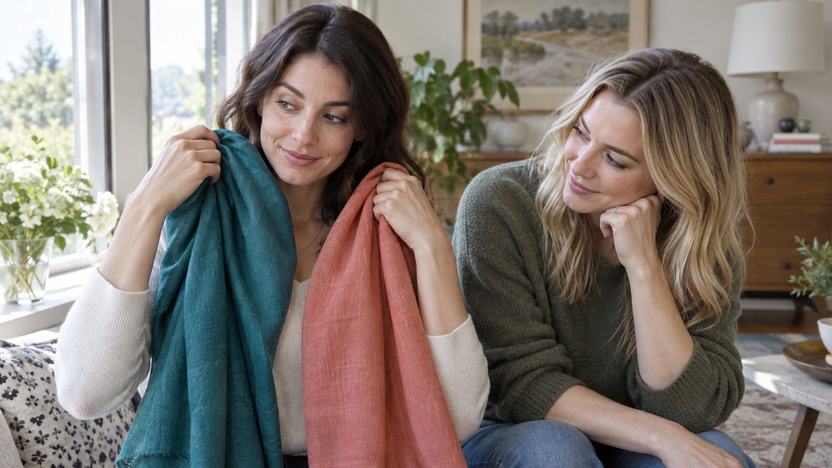
Start with pairs that sit close together in value and brightness. Compare soft white with cream, cool taupe with warm stone, blue-red with muted coral, or olive with blue-green. Hold the fabrics at the jawline in indirect daylight, or try on tops with similar necklines. A plain wall and a makeup-light face make the smaller differences easier to read.
Look for balance rather than a dramatic “wow.” The more compatible option often makes the skin look even, the eyes look alert, and the transition from face to neck look calm. The less compatible one may emphasize redness, a yellow cast, grayness, or shadows around the mouth. You are not looking for flawless skin; you are noticing which colour does not compete with the features you already have.
Next, test the midpoint. If crisp white is too cold and cream is too yellow, try soft white, ivory with a little gray, or a pale mushroom tone. If camel is too warm and slate is too cool, try taupe, mushroom, muted olive, or cocoa. These in-between shades are often called balanced neutrals because they carry enough warmth or coolness to feel alive without pulling the complexion in one direction.
Metal can be a useful secondary check, not a final test. Some neutral people like both gold and silver, but may prefer brushed gold over bright yellow gold, or oxidized silver over mirror-bright silver. Hold earrings, chains, or small pieces of fabric near the face rather than judging them against a hand. If both metals work, notice which one looks most natural with your most reliable clothes. The combinations tell more than a single jewellery preference.
Test depth and saturation separately
Once you have a warm-cool midpoint, stop changing everything at once. Choose one colour family and test its depth. For blue, compare pale powder blue, medium denim, smoky teal, and deep navy. For red, try soft rose, muted berry, brick, and dark wine. If medium and deep versions consistently work while the palest option disappears, you have learned something important about value that a neutral undertone test alone could not show.
Then compare saturation. Put a clear royal blue beside a smoky blue, a bright pink beside a dusty rose, or a sharp emerald beside a softened forest green. A person who looks best in muted colours is not limited to dull clothing; they may simply need colours with a little complexity. A person who thrives in clear colour can still choose warm or cool directions, but may need a cleaner edge to avoid looking faded.
Contrast is the final useful check. Notice the natural light-dark difference between skin, hair, brows, and eyes. High contrast can often hold a darker neutral with a light top or a more graphic print. Low-to-medium contrast may look more coherent in tonal outfits, where the colours sit closer together in value. This is a style choice as well as a visual one, so test it in outfits you would genuinely wear rather than only against isolated fabric.
Keep notes during the process. A phrase like “muted cool colours work, but only medium-to-deep” is far more useful than a bare label. It helps with lipstick, hair colour ideas, coats, glasses, and shopping decisions. It also makes room for variation: a crisp colour might work in a small scarf, while its softer version is better for a large sweater.
Create a flexible neutral palette
A practical palette begins with two or three balanced neutrals. For one person that might be soft navy, charcoal, and cool taupe; for another, deep olive, mushroom, and cocoa. Choose the ones that repeatedly make your face look clear in daylight and that also work with the clothes you already enjoy. A reliable neutral is valuable because it can anchor dozens of outfits without feeling like a compromise.
Add three colour families that passed your fabric tests. You might choose muted teal, dusty berry, and soft rose; or medium blue, burgundy, and sage. Keep them in the same broad range of depth at first. This makes mixing easier and reveals whether the palette is actually workable in daily life. A photo of the small group on your phone can help when you are comparing colours in a shop, though it should not replace looking at a garment beside your face.
Give yourself one or two high-interest accents. These are colours you love even if they are a little brighter, warmer, or cooler than the core palette. Use them in a lipstick, a print, a bag, shoes, or a smaller layer. An accent can bring personality to a neutral palette without making every near-face item compete for attention.
Finally, let the palette change as evidence changes. Hair dye, seasonal surface tone, glasses, and new preferences can all alter what feels most useful. Revisit the same comparisons after a major change, keep the colours that continue to support you, and release the ones that only worked in theory. A neutral undertone is not an absence of direction; it is an invitation to find your own balance between warm, cool, soft, deep, and clear.