Deep summer is a useful informal name for a color direction that combines coolness, noticeable depth, and a softened finish. It is not a universal or official category, and different systems divide seasons in different ways. Still, the idea can help when very light summer colors feel too pale, while clear winter colors feel too sharp: you may need richer cool shades with a little smoke rather than more brightness.
What people mean by deep summer
In a classic four-season system, summer is usually cool and muted, while winter is cool and clearer with stronger contrast. “Deep summer” often describes the area between them: colors are cool or neutral-cool, medium-deep to deep in value, and less icy or vivid than a typical winter palette. The face may have enough hair and eye depth to hold charcoal, dark navy, and berry, but not necessarily the crisp black-and-white contrast that suits some winter-like palettes.
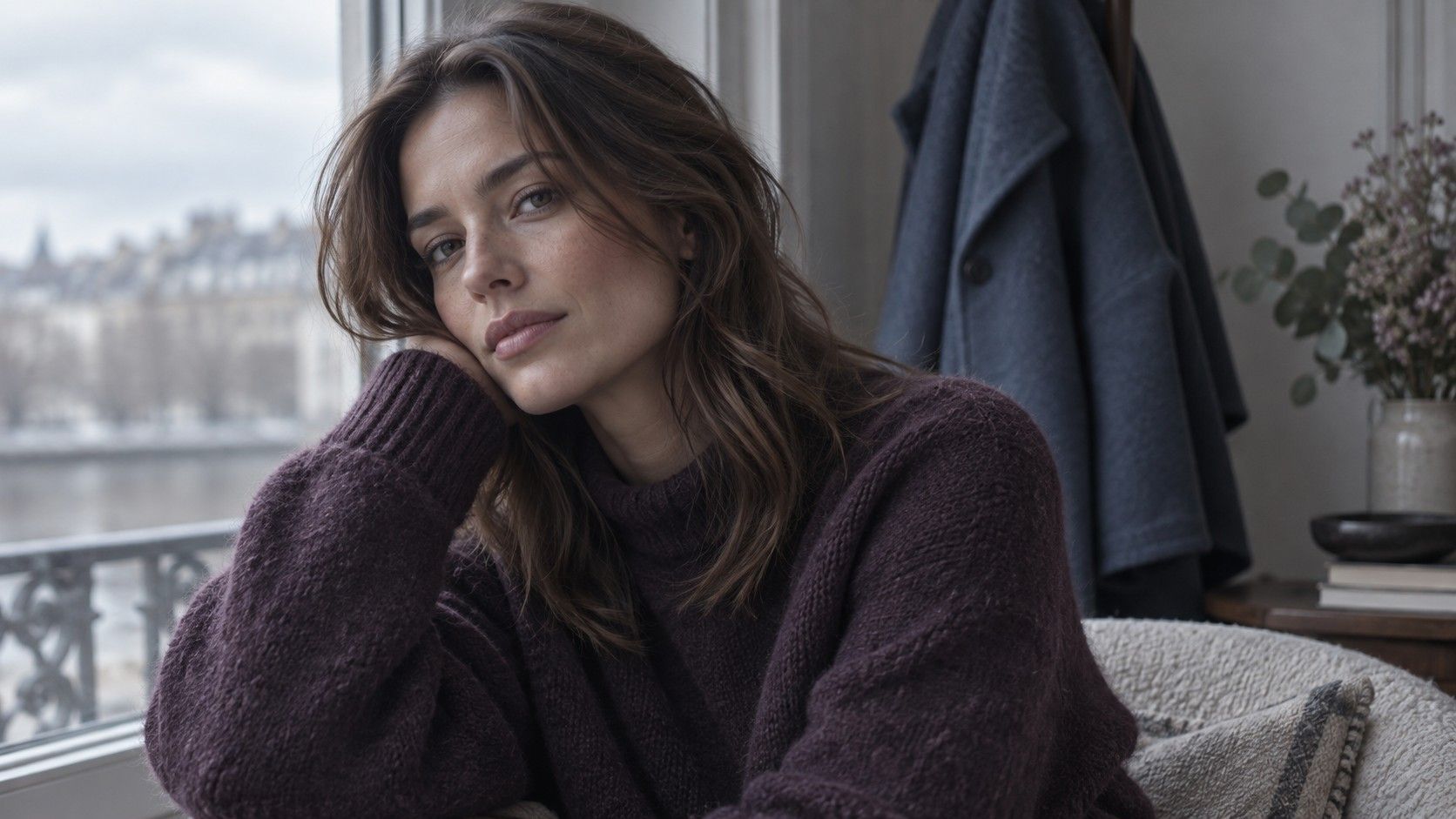
The important qualities are more useful than the name. Deep summer colors often feel blue-based, grayed, smoky, or softened by a little brown. Think of deep teal with a slate cast, dark raspberry rather than neon pink, aubergine, stormy blue, softened pine, and blue-charcoal. These are sometimes called smoky jewel tones because they retain richness without looking glossy or electric.
This direction should be tested, not assigned from hair color alone. Dark brown hair, gray eyes, pale skin, or a cool undertone can all occur in many palette groups. What matters is the comparison beside the face. If a dark muted blue makes the eyes look present and the skin look even, while a bright cobalt looks separate from the face, that is a more helpful clue than any description of who is supposed to be deep summer.
Deep summer versus soft summer
Soft summer palettes are often medium in depth and gently muted. They may favor dusty blue, mauve, cool gray, softened lavender, muted rose, and gentle navy. A deep summer direction keeps the same softness but moves downward in value. It may prefer ink blue over pale denim, mulberry over shell pink, and charcoal over light gray. The transition should feel like adding depth, not turning every shade into black.
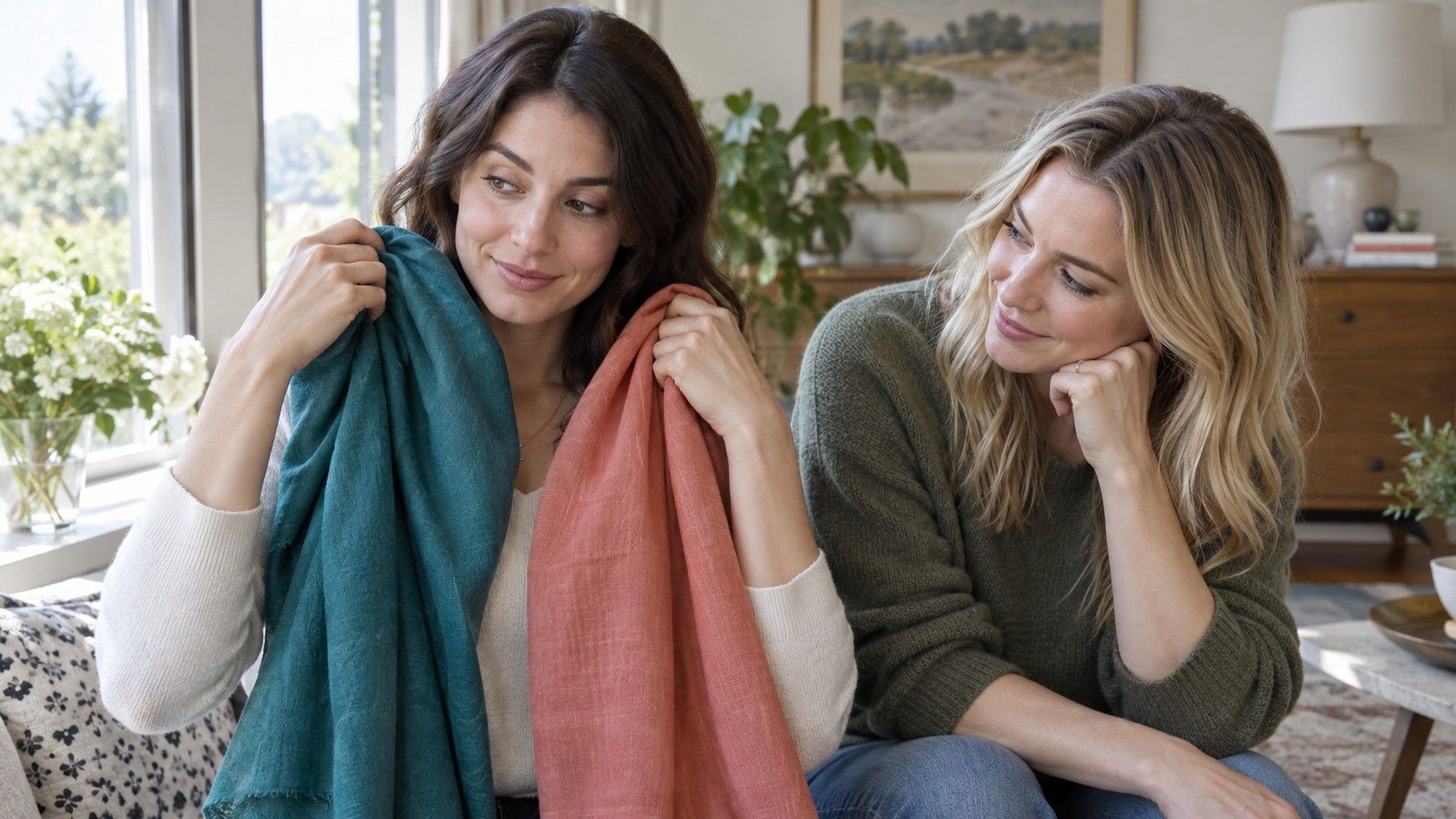
Compare related fabrics in daylight: muted berry with deep muted berry, medium slate with blue-charcoal, or dusty teal with deep smoky teal. If the deeper option adds definition without making under-eye shadows more obvious, it may belong in your most useful range. If it starts to look heavy or severe, stay closer to a soft summer depth. The best result is often a middle ground: rich enough to echo hair and eye depth, soft enough that the garment does not dominate the face.
Deep soft summer is another phrase used for this neighborhood. It can be helpful as a search term, but it should not lead to a hunt for a single approved swatch fan. A person may borrow the deep neutrals and muted berry shades from one description, then prefer the lighter blue-greens from another. The wardrobe becomes more wearable when these choices are based on repeated comparisons rather than on defending a precise label.
Build a practical palette from neutrals outward
Start with three or four deep neutrals, because they determine whether a palette works on regular days. Blue-charcoal, soft navy, cool brown, mushroom taupe, deep pewter, and muted cocoa are useful possibilities. Cool brown is especially worth testing: it has enough gray or blue influence to sit comfortably beside a cool complexion, unlike an orange-heavy chocolate or golden camel that may pull attention away from the face.
Next add a small group of color families. Muted berry, blackberry, plum, smoky sapphire, blue-green teal, pine, cool burgundy, and softened wine are often easier to combine than a long list of isolated shades. Choose versions with some depth but without a fluorescent or enamel-like finish. A rich color can still be soft; the question is whether it has a gray, smoky, or weathered quality that connects it to the rest of the palette.
Use light colors carefully rather than avoiding them. Soft white, dove gray, stone, cool blush, and pale blue can work as shirts or layers when they are not too stark. If optic white feels harsh, try a grayed white or a cool off-white. If black is workable but not ideal, reserve it for trousers, shoes, or small patterns and choose blue-charcoal or navy for collars and sweaters. This keeps the depth you want without creating a hard border around the face.
Hair-color decisions without overcorrecting
Questions about soft summer hair color often arise because hair is part of the contrast picture. A deep summer-leaning palette does not require a particular hair shade, and it does not prescribe salon color. Natural hair can be dark, medium, silvering, or highlighted while the same clothing colors remain useful. The practical issue is whether a hair change alters the balance between skin, brows, eyes, and clothing.
When considering color, compare the proposed shade with your best neutrals and berries before making a major change. Very warm caramel, orange-red, or gold-heavy highlights can make cool muted clothing look disconnected. Extremely inky black can increase contrast enough that softer colors begin to look faded. Cooler brown, ash brown, mushroom-toned highlights, muted auburn-brown, or gentle blue-black can sometimes preserve the soft-cool balance, but the result depends on the starting color and maintenance.
The best hair color for soft summer is therefore not a fixed dye name. It is a shade that does not force you into a different clothing contrast level every morning. If you enjoy a warm or vivid hair experiment, you can still wear it; simply expect to reassess the near-face colors that look easiest. Bring fabric swatches or photographs of your favorite shirts to a consultation, and judge the result in daylight after the initial styling has settled.
How to avoid colors that turn too stark
Colors become too stark when they are brighter, lighter, darker, warmer, or clearer than your features can comfortably balance. For a deep summer direction, the common issue is not depth itself but clarity. Pure primary blue, sharp emerald, hot pink, bright orange-red, optic white, and vivid yellow can appear separate from a smoky cool face. A softened alternative often keeps the same mood: slate sapphire instead of electric blue, muted raspberry instead of fuchsia, blue-green pine instead of bright emerald.
Patterns matter too. A high-contrast black-and-white print can feel sharper than either color worn alone. Try prints where the colors are close in depth, where edges are less graphic, or where one dominant cool neutral holds the composition together. Jewelry and makeup can be used in the same way. Brushed silver, pewter, smoky stones, a muted berry lip, or a cool rose blush may feel more integrated than highly reflective gold or an intensely bright lip color, though personal preference remains part of the choice.
Use your mirror as the final editor. Put a likely color next to the face in window light, then compare it with a softer, cooler, or less saturated version. If the second fabric makes you look more rested without making you disappear, keep that observation. A deep summer color palette is most useful when it gives you a vocabulary for these small adjustments: depth with softness, coolness without iciness, and color that supports the face instead of competing with it.